/*! normalize.css v3.0.1 | MIT License | git.io/normalize */html{font-family:sans-serif;-ms-text-size-adjust:100%;-webkit-text-size-adjust:100%}body{margin:0}article,aside,details,figcaption,figure,footer,header,hgroup,main,nav,section,summary{display:block}audio,canvas,progress,video{display:inline-block;vertical-align:baseline}audio:not([controls]){display:none;height:0}[hidden],template{display:none}a{background:transparent}a:active,a:hover{outline:0}abbr[title]{border-bottom:1px dotted}b,strong{font-weight:bold}dfn{font-style:italic}h1{font-size:2em;margin:.67em 0}mark{background:#ff0;color:#000}small{font-size:80%}sub,sup{font-size:75%;line-height:0;position:relative;vertical-align:baseline}sup{top:-0.5em}sub{bottom:-0.25em}img{border:0}svg:not(:root){overflow:hidden}figure{margin:1em 40px}hr{-moz-box-sizing:content-box;box-sizing:content-box;height:0}pre{overflow:auto}code,kbd,pre,samp{font-family:monospace,monospace;font-size:1em}button,input,optgroup,select,textarea{color:inherit;font:inherit;margin:0}button{overflow:visible}button,select{text-transform:none}button,html input[type="button"],input[type="reset"],input[type="submit"]{-webkit-appearance:button;cursor:pointer}button[disabled],html input[disabled]{cursor:default}button::-moz-focus-inner,input::-moz-focus-inner{border:0;padding:0}input{line-height:normal}input[type="checkbox"],input[type="radio"]{box-sizing:border-box;padding:0}input[type="number"]::-webkit-inner-spin-button,input[type="number"]::-webkit-outer-spin-button{height:auto}input[type="search"]{-webkit-appearance:textfield;-moz-box-sizing:content-box;-webkit-box-sizing:content-box;box-sizing:content-box}input[type="search"]::-webkit-search-cancel-button,input[type="search"]::-webkit-search-decoration{-webkit-appearance:none}fieldset{border:1px solid #c0c0c0;margin:0 2px;padding:.35em .625em .75em}legend{border:0;padding:0}textarea{overflow:auto}optgroup{font-weight:bold}table{border-collapse:collapse;border-spacing:0}td,th{padding:0} .skip-navigation { background-color: #fff; box-sizing: border-box; color: #000; display: block; height: 0; left: 0; line-height: 50px; overflow: hidden; padding-top: 0; position: fixed; text-align: center; top: 0; -webkit-transition: box-shadow .3s , height .3s , padding-top .3s; transition: box-shadow .3s , height .3s , padding-top .3s; width: 100%; z-index: 900; } .skip-navigation:focus { box-shadow: 0 4px 5px 0 rgba(0,0,0,0.14) , 0 1px 10px 0 rgba(0,0,0,0.12) , 0 2px 4px -1px rgba(0,0,0,0.2); height: 50px; } #main { outline: none; } body { overflow-wrap: break-word; word-break: break-word; word-wrap: break-word; } .hidden { display: none; } .invisible { visibility: hidden; } .container:after, .float-container:after { clear: both; content: ""; display: table; } .clearboth { clear: both; } .dim-overlay { background-color: rgba(0,0,0,0.54); height: 100vh; left: 0; position: fixed; top: 0; width: 100%; } #sharing-dim-overlay { background-color: transparent; } .main-heading { position: absolute; clip: rect(1px,1px,1px,1px); padding: 0; border: 0; height: 1px; width: 1px; overflow: hidden; } .loading-spinner-large { -webkit-animation: mspin-rotate 1568.63ms infinite linear; animation: mspin-rotate 1568.63ms infinite linear; height: 48px; overflow: hidden; position: absolute; width: 48px; z-index: 200; } .loading-spinner-large>div { -webkit-animation: mspin-revrot 5332ms infinite steps(4); animation: mspin-revrot 5332ms infinite steps(4); } .loading-spinner-large>div>div { -webkit-animation: mspin-singlecolor-large-film 1333ms infinite steps(81); animation: mspin-singlecolor-large-film 1333ms infinite steps(81); background-size: 100%; height: 48px; width: 3888px; } .mspin-black-large>div>div, .mspin-grey_54-large>div>div { background-image: url(../../indie/mspin_black_large.svg); } .mspin-white-large>div>div { background-image: url(../../indie/mspin_white_large.svg); } .mspin-grey_54-large { opacity: .54; } @-webkit-keyframes mspin-singlecolor-large-film { 0% { -webkit-transform: translateX(0); transform: translateX(0); } to { -webkit-transform: translateX(-3888px); transform: translateX(-3888px); } } @keyframes mspin-singlecolor-large-film { 0% { -webkit-transform: translateX(0); transform: translateX(0); } to { -webkit-transform: translateX(-3888px); transform: translateX(-3888px); } } @-webkit-keyframes mspin-rotate { 0% { -webkit-transform: rotate(0deg); transform: rotate(0deg); } to { -webkit-transform: rotate(360deg); transform: rotate(360deg); } } @keyframes mspin-rotate { 0% { -webkit-transform: rotate(0deg); transform: rotate(0deg); } to { -webkit-transform: rotate(360deg); transform: rotate(360deg); } } @-webkit-keyframes mspin-revrot { 0% { -webkit-transform: rotate(0deg); transform: rotate(0deg); } to { -webkit-transform: rotate(-360deg); transform: rotate(-360deg); } } @keyframes mspin-revrot { 0% { -webkit-transform: rotate(0deg); transform: rotate(0deg); } to { -webkit-transform: rotate(-360deg); transform: rotate(-360deg); } } input::-ms-clear { display: none; } .blogger-logo, .svg-icon-24.blogger-logo { fill: #ff9800; opacity: 1; } .widget.Attribution { margin-top: 1em; text-align: center; } .widget.Attribution .blogger img, .widget.Attribution .blogger svg { vertical-align: bottom; } .widget.Attribution .blogger img { margin-right: .5em; } .widget.Attribution div { line-height: 24px; margin-top: .5em; } .widget.Attribution .image-attribution, .widget.Attribution .copyright { font-size: .7em; margin-top: 1.5em; } .item-control { display: none; } .BLOG_mobile_video_class { display: none; } .bg-photo { background-attachment: scroll !important; } body .CSS_LIGHTBOX { z-index: 900; } .extendable .show-more, .extendable .show-less { border-color: #25a186; color: #25a186; margin-top: 8px; } .extendable .show-more.hidden, .extendable .show-less.hidden { display: none; } .inline-ad { display: none; max-width: 100%; overflow: hidden; } .adsbygoogle { display: block; } #cookieChoiceInfo { bottom: 0; top: auto; } iframe.b-hbp-video { border: none; } .post-body img { max-width: 100%; } .post-body iframe { max-width: 100%; } .post-body a[imageanchor="1"] { display: inline-block; } .byline { margin-right: 1em; } .byline:last-child { margin-right: 0; } .paging-control-container { margin-bottom: 16px; } .paging-control-container .paging-control { display: inline-block; } .paging-control-container .paging-control, .paging-control-container .comment-range-text:after { color: #25a186; } .paging-control-container .paging-control, .paging-control-container .comment-range-text { margin-right: 8px; } .paging-control-container .comment-range-text:after, .paging-control-container .paging-control:after { content: "\b7"; cursor: default; pointer-events: none; } .paging-control-container .comment-range-text:last-child:after, .paging-control-container .paging-control:last-child:after { content: none; } .paging-control-container .comment-range-text:after, .paging-control-container .paging-control:after { padding-left: 8px; } .byline.reactions iframe { height: 20px; } .b-notification { color: #000; background-color: white; border-bottom: solid 1px #000; box-sizing: border-box; padding: 16px 32px; text-align: center; } .b-notification.visible { -webkit-transition: margin-top .3s cubic-bezier(0.4,0.0,0.2,1); transition: margin-top .3s cubic-bezier(0.4,0.0,0.2,1); } .b-notification.invisible { position: absolute; } .b-notification-close { position: absolute; right: 8px; top: 8px; } .no-posts-message { line-height: 40px; text-align: center; } @media screen and (max-width: 968px) { body.item-view .post-body a[imageanchor="1"][style*="float: left;"], body.item-view .post-body a[imageanchor="1"][style*="float: right;"] { float: none !important; clear: none !important; } body.item-view .post-body a[imageanchor="1"] img { display: block; height: auto; margin: 0 auto; } body.item-view .post-body a[imageanchor="1"][style*="float: left;"] img, body.item-view .post-body .separator[style*="text-align: left"] a[imageanchor="1"] img { margin: 0 auto 0 0; } body.item-view .post-body a[imageanchor="1"][style*="float: right;"] img, body.item-view .post-body .separator[style*="text-align: right"] a[imageanchor="1"] img { margin: 0 0 0 auto; } .post-body a[imageanchor] { display: block; } body.item-view .post-body a[imageanchor="1"] { margin-left: 0 !important; margin-right: 0 !important; } body.item-view .post-body a[imageanchor="1"]+a[imageanchor="1"] { margin-top: 16px; } } #comments { border-top: 1px dashed rgba(0,0,0,0.54); margin-top: 20px; padding: 20px; } #comments .comment-thread ol { margin: 0; padding-left: 0; } #comments .comment-thread ol { padding-left: 0; } #comments .comment-thread .comment-replies, #comments .comment .comment-replybox-single { margin-left: 60px; } #comments .comment-thread .thread-count { display: none; } #comments .comment { list-style-type: none; padding: 0 0 30px; position: relative; } #comments .comment .comment { padding-bottom: 8px; } .comment .avatar-image-container { position: absolute; } .comment .avatar-image-container img { border-radius: 50%; } .avatar-image-container svg, .comment .avatar-image-container .avatar-icon { border-radius: 50%; border: solid 1px #25a186; box-sizing: border-box; fill: #25a186; height: 35px; margin: 0; padding: 7px; width: 35px; } .comment .comment-block { margin-top: 10px; padding-bottom: 0; } .comment .comment-block { margin-left: 60px; } #comments .comment-author-header-wrapper { margin-left: 40px; } #comments .comment .thread-expanded .comment-block { padding-bottom: 20px; } #comments .comment .comment-header .user, #comments .comment .comment-header .user a { color: #292929; font-style: normal; font-weight: bold; } #comments .comment .comment-actions { background: transparent; border: none; box-shadow: none; color: #25a186; cursor: pointer; font-size: 14px; font-weight: bold; outline: none; text-decoration: none; text-transform: uppercase; width: auto; bottom: 0; margin-bottom: 15px; position: absolute; } #comments .comment .comment-actions>* { margin-right: 8px; } #comments .comment .comment-header .datetime { bottom: 0; color: rgba(0,0,0,0.54); display: inline-block; font-size: 13px; font-style: italic; } #comments .comment .comment-header .datetime { margin-left: 8px; } #comments .comment .comment-header .datetime a, #comments .comment .comment-footer .comment-timestamp a { color: rgba(0,0,0,0.54); } .comment .comment-body, #comments .comment .comment-content { margin-top: 12px; word-break: break-word; } .comment-body { margin-bottom: 12px; } #comments.embed[data-num-comments="0"] { border: none; margin-top: 0; padding-top: 0; } #comments.embed[data-num-comments="0"] #comment-post-message, #comments.embed[data-num-comments="0"] div.comment-form>p, #comments.embed[data-num-comments="0"] p.comment-footer { display: none; } #comment-editor-src { display: none; } .comments .comments-content .loadmore.loaded { max-height: 0; opacity: 0; overflow: hidden; } .extendable .remaining-items { height: 0; overflow: hidden; -webkit-transition: height .3s cubic-bezier(0.4,0.0,0.2,1); transition: height .3s cubic-bezier(0.4,0.0,0.2,1); } .extendable .remaining-items.expanded { height: auto; } .svg-icon-24, .svg-icon-24-button { cursor: pointer; height: 24px; width: 24px; min-width: 24px; } .touch-icon { margin: -12px; padding: 12px; } html[dir=rtl] .rtl-reversible-icon { -webkit-transform: scaleX(-1); -ms-transform: scaleX(-1); transform: scaleX(-1); } svg:not(:root).touch-icon { overflow: visible; } .touch-icon:focus, .touch-icon:active { background-color: rgba(153,153,153,.4); border-radius: 50%; } .touch-icon-button, .svg-icon-24-button { background: transparent; border: none; margin: 0; outline: none; padding: 0; } .touch-icon-button .touch-icon:focus, .touch-icon-button .touch-icon:active { background-color: transparent; } .touch-icon-button:focus .touch-icon, .touch-icon-button:active .touch-icon { background-color: rgba(153,153,153,.4); border-radius: 50%; } .widget.Profile .default-avatar-wrapper .avatar-icon { border-radius: 50%; border: solid 1px #000000; box-sizing: border-box; fill: #000000; margin: 0; } .widget.Profile .individual .profile-img, .widget.Profile .individual .avatar-icon { height: 120px; width: 120px; } .widget.Profile .team .profile-img, .widget.Profile .team .avatar-icon, .widget.Profile .team .default-avatar-wrapper { height: 40px; width: 40px; } .widget.Profile .individual .default-avatar-wrapper .avatar-icon { padding: 25px; } .widget.Profile .team .default-avatar-wrapper .avatar-icon { padding: 8px; } .snippet-container { margin: 0; position: relative; overflow: hidden; } .snippet-fade { bottom: 0; box-sizing: border-box; position: absolute; width: 96px; } .snippet-fade { right: 0; } .snippet-fade:after { content: '\2026'; } .snippet-fade:after { float: right; } .post-bottom { -webkit-box-align: center; -webkit-align-items: center; -ms-flex-align: center; align-items: center; display: -webkit-box; display: -webkit-flex; display: -ms-flexbox; display: flex; -webkit-flex-wrap: wrap; -ms-flex-wrap: wrap; flex-wrap: wrap; } .post-footer { -webkit-box-flex: 1; -webkit-flex: 1 1 auto; -ms-flex: 1 1 auto; flex: 1 1 auto; -webkit-flex-wrap: wrap; -ms-flex-wrap: wrap; flex-wrap: wrap; -webkit-box-ordinal-group: 2; -webkit-order: 1; -ms-flex-order: 1; order: 1; } .post-footer>* { -webkit-box-flex: 0; -webkit-flex: 0 1 auto; -ms-flex: 0 1 auto; flex: 0 1 auto; } .post-footer .byline:last-child { margin-right: 1em; } .jump-link { -webkit-box-flex: 0; -webkit-flex: 0 0 auto; -ms-flex: 0 0 auto; flex: 0 0 auto; -webkit-box-ordinal-group: 3; -webkit-order: 2; -ms-flex-order: 2; order: 2; } .centered-top-container.sticky { left: 0; position: fixed; right: 0; top: 0; width: auto; z-index: 8; -webkit-transition-property: opacity , -webkit-transform; transition-property: opacity , -webkit-transform; transition-property: transform , opacity; transition-property: transform , opacity , -webkit-transform; -webkit-transition-duration: .2s; transition-duration: .2s; -webkit-transition-timing-function: cubic-bezier(0.4,0.0,0.2,1); transition-timing-function: cubic-bezier(0.4,0.0,0.2,1); } .centered-top-placeholder { display: none; } .collapsed-header .centered-top-placeholder { display: block; } .centered-top-container .Header .replaced h1, .centered-top-placeholder .Header .replaced h1 { display: none; } .centered-top-container.sticky .Header .replaced h1 { display: block; } .centered-top-container.sticky .Header .header-widget { background: none; } .centered-top-container.sticky .Header .header-image-wrapper { display: none; } .centered-top-container img, .centered-top-placeholder img { max-width: 100%; } .collapsible { -webkit-transition: height .3s cubic-bezier(0.4,0.0,0.2,1); transition: height .3s cubic-bezier(0.4,0.0,0.2,1); } .collapsible, .collapsible>summary { display: block; overflow: hidden; } .collapsible>:not(summary) { display: none; } .collapsible[open]>:not(summary) { display: block; } .collapsible:focus, .collapsible>summary:focus { outline: none; } .collapsible>summary { cursor: pointer; display: block; padding: 0; } .collapsible:focus>summary, .collapsible>summary:focus { background-color: transparent; } .collapsible>summary::-webkit-details-marker { display: none; } .collapsible-title { -webkit-box-align: center; -webkit-align-items: center; -ms-flex-align: center; align-items: center; display: -webkit-box; display: -webkit-flex; display: -ms-flexbox; display: flex; } .collapsible-title .title { -webkit-box-flex: 1; -webkit-flex: 1 1 auto; -ms-flex: 1 1 auto; flex: 1 1 auto; -webkit-box-ordinal-group: 1; -webkit-order: 0; -ms-flex-order: 0; order: 0; overflow: hidden; text-overflow: ellipsis; white-space: nowrap; } .collapsible-title .chevron-down, .collapsible[open] .collapsible-title .chevron-up { display: block; } .collapsible-title .chevron-up, .collapsible[open] .collapsible-title .chevron-down { display: none; } .overflowable-container { max-height: 48px; overflow: hidden; position: relative; } .overflow-button { cursor: pointer; } #overflowable-dim-overlay { background: transparent; } .overflow-popup { box-shadow: 0 2px 2px 0 rgba(0,0,0,.14) , 0 3px 1px -2px rgba(0,0,0,.2) , 0 1px 5px 0 rgba(0,0,0,.12); background-color: #ffffff; left: 0; max-width: calc(100% - 32px); position: absolute; top: 0; visibility: hidden; z-index: 101; } .overflow-popup ul { list-style: none; } .overflow-popup li, .overflow-popup .tabs li { display: block; height: auto; } .overflow-popup .tabs li { padding-left: 0; padding-right: 0; } .overflow-button.hidden, .overflow-popup li.hidden, .overflow-popup .tabs li.hidden { display: none; } .ripple { position: relative; } .ripple>* { z-index: 1; } .splash-wrapper { bottom: 0; left: 0; overflow: hidden; pointer-events: none; position: absolute; right: 0; top: 0; z-index: 0; } .splash { background: hsl(0,0%,80%); border-radius: 100%; display: block; opacity: .6; position: absolute; -webkit-transform: scale(0); -ms-transform: scale(0); transform: scale(0); } .splash.animate { -webkit-animation: ripple-effect .4s linear; animation: ripple-effect .4s linear; } @-webkit-keyframes ripple-effect { to { opacity: 0; -webkit-transform: scale(2.5); transform: scale(2.5); } } @keyframes ripple-effect { to { opacity: 0; -webkit-transform: scale(2.5); transform: scale(2.5); } } .search { display: -webkit-box; display: -webkit-flex; display: -ms-flexbox; display: flex; line-height: 24px; width: 24px; } .search form { z-index: 101; } .search h3 { display: none; } .search.focused { width: 100%; } .search.focused .section { width: 100%; } .search-expand { -webkit-box-flex: 0; -webkit-flex: 0 0 auto; -ms-flex: 0 0 auto; flex: 0 0 auto; } .search-expand-text { display: none; } .search-close { display: inline; vertical-align: middle; } .search form { display: -webkit-box; display: -webkit-flex; display: -ms-flexbox; display: flex; -webkit-box-flex: 1; -webkit-flex: 1 0 0; -ms-flex: 1 0 0px; flex: 1 0 0; border-bottom: solid 1px transparent; padding-bottom: 8px; } .search form>* { display: none; } .search.focused form>* { display: block; } .search .search-input label { display: none; } .centered-top-placeholder.cloned .search form { z-index: 30; } .search.focused form { border-color: #292929; position: relative; width: auto; } .collapsed-header .centered-top-container .search.focused form { border-bottom-color: transparent; } .search-input { -webkit-box-flex: 1; -webkit-flex: 1 0 1px; -ms-flex: 1 0 1px; flex: 1 0 1px; } .search-input input { background: none; border: none; box-sizing: border-box; color: #292929; display: inline-block; outline: none; width: calc(100% - 48px); } .search-input input.no-cursor { color: transparent; text-shadow: 0 0 0 #292929; } .collapsed-header .centered-top-container .search-action, .collapsed-header .centered-top-container .search-input input { color: #292929; } .collapsed-header .centered-top-container .search-input input.no-cursor { color: transparent; text-shadow: 0 0 0 #292929; } .search-input input.no-cursor:focus, .collapsed-header .centered-top-container .search-input input.no-cursor:focus { outline: none; } .search-focused>* { visibility: hidden; } .search-focused .search, .search-focused .search-icon { visibility: visible; } .search.focused .search-action { display: block; } .search.focused .search-action:disabled { opacity: .3; } .sidebar-container { background-color: #f7f7f7; max-width: 320px; overflow-y: auto; -webkit-transition-property: -webkit-transform; transition-property: -webkit-transform; transition-property: transform; transition-property: transform, -webkit-transform; -webkit-transition-duration: .3s; transition-duration: .3s; -webkit-transition-timing-function: cubic-bezier(0.0,0.0,0.2,1); transition-timing-function: cubic-bezier(0.0,0.0,0.2,1); width: 320px; z-index: 101; -webkit-overflow-scrolling: touch; } .sidebar-container .navigation { line-height: 0; padding: 20px; } .sidebar-container .widget { background: none; margin: 0 16px; padding: 1em 0; } .sidebar-container .widget .title { color: #000000; margin: 0; } .sidebar-container .widget ul { list-style: none; margin: 0; padding: 0; } .sidebar-container .widget ul ul { margin-left: 1em; } .sidebar-container .widget ul li { font-size: 16px; line-height: normal; } .BlogArchive li { margin: 16px 0; } .BlogArchive li:last-child { margin-bottom: 0; } .Label .label-count:before, .BlogArchive .post-count:before { content: '('; } .Label .label-count:after, .BlogArchive .post-count:after { content: ')'; } .Label .label-count, .BlogArchive .post-count { float: right; margin-left: .25em; } .Label li a { display: inline-block; } .widget.Translate .skiptranslate>div { display: block !important; } .widget.Profile .profile-link { background-image: none !important; display: -webkit-box; display: -webkit-flex; display: -ms-flexbox; display: flex; } .widget.Profile .team-member .profile-img, .widget.Profile .team-member .default-avatar-wrapper { -webkit-box-flex: 0; -webkit-flex: 0 0 auto; -ms-flex: 0 0 auto; flex: 0 0 auto; } .widget.Profile .team-member .profile-img, .widget.Profile .team-member .default-avatar-wrapper { margin-right: 1em; } .widget.Profile .individual .profile-link { -webkit-box-orient: vertical; -webkit-box-direction: normal; -webkit-flex-direction: column; -ms-flex-direction: column; flex-direction: column; } .widget.Profile .team .profile-link .profile-name { -webkit-align-self: center; -ms-flex-item-align: center; -ms-grid-row-align: center; align-self: center; display: block; -webkit-box-flex: 1; -webkit-flex: 1 1 auto; -ms-flex: 1 1 auto; flex: 1 1 auto; } .sidebar-container .sidebar-back { cursor: pointer; } .sidebar-container .widget+.widget { border-top: 1px dashed #000000; } .dim-overlay { background-color: rgba(0,0,0,0.54); z-index: 100; } body.sidebar-visible { overflow-y: hidden; } @media screen and (max-width: 1619px) { .sidebar-container { bottom: 0; position: fixed; top: 0; } .sidebar-container { left: auto; right: 0; } .sidebar-container.sidebar-invisible { -webkit-transition-timing-function: cubic-bezier(0.4,0.0,0.6,1); transition-timing-function: cubic-bezier(0.4,0.0,0.6,1); } .sidebar-container.sidebar-invisible { -webkit-transform: translateX(320px); -ms-transform: translateX(320px); transform: translateX(320px); } } .dialog { box-shadow: 0 2px 2px 0 rgba(0,0,0,.14) , 0 3px 1px -2px rgba(0,0,0,.2) , 0 1px 5px 0 rgba(0,0,0,.12); background: #ffffff; box-sizing: border-box; padding: 30px; position: fixed; text-align: center; width: calc(100% - 24px); z-index: 101; } .dialog input[type=text], .dialog input[type=email] { background-color: transparent; border-bottom: solid 1px rgba(41,41,41,0.12); border-left: none; border-right: none; border-top: none; color: #292929; display: block; font-family: Lora, serif; font-size: 16px; line-height: 24px; margin: auto; padding-bottom: 7px; outline: none; text-align: center; width: 100%; } .dialog input[type=text]::-webkit-input-placeholder, .dialog input[type=email]::-webkit-input-placeholder { color: #292929; } .dialog input[type=text]::-moz-placeholder, .dialog input[type=email]::-moz-placeholder { color: #292929; } .dialog input[type=text]:-ms-input-placeholder, .dialog input[type=email]:-ms-input-placeholder { color: #292929; } .dialog input[type=text]::placeholder, .dialog input[type=email]::placeholder { color: #292929; } .dialog input[type=text]:focus, .dialog input[type=email]:focus { border-bottom: solid 2px #25a186; padding-bottom: 6px; } .dialog input[type=submit] { font-family: Lora, serif; } .dialog input.no-cursor { color: transparent; text-shadow: 0 0 0 #292929; } .dialog input.no-cursor:focus { outline: none; } .subscribe-popup { max-width: 364px; } .subscribe-popup h3 { color: #ffffff; font-size: 1.8em; margin-top: 0; } .subscribe-popup div.widget.FollowByEmail h3 { display: none; } .subscribe-popup div.widget.FollowByEmail .follow-by-email-submit { background: transparent; border: none; box-shadow: none; color: #25a186; cursor: pointer; font-size: 14px; font-weight: bold; outline: none; text-decoration: none; text-transform: uppercase; width: auto; color: #25a186; display: inline-block; margin: 0 auto; margin-top: 24px; width: auto; white-space: normal; } .subscribe-popup div.widget.FollowByEmail .follow-by-email-submit:disabled { cursor: default; opacity: .3; } @media (max-width:800px) { .blog-name div.widget.Subscribe { margin-bottom: 16px; } body.item-view .blog-name div.widget.Subscribe { margin: 8px auto 16px; width: 100%; } } body#layout .bg-photo-overlay, body#layout .bg-photo { display: none; } body#layout .page_body { padding: 0; position: relative; top: 0; } body#layout .page { display: inline-block; left: inherit; position: relative; vertical-align: top; width: 540px; } body#layout .centered { max-width: 954px; } body#layout .navigation { display: none; } body#layout .sidebar-container { display: inline-block; width: 40%; } body#layout .hamburger-menu, body#layout .search { display: none; } .widget.Sharing .sharing-button { display: none; } .widget.Sharing .sharing-buttons li { padding: 0; } .widget.Sharing .sharing-buttons li span { display: none; } .post-share-buttons { position: relative; } .share-buttons .svg-icon-24, .centered-bottom .share-buttons .svg-icon-24 { fill: #25a186; } .sharing-open.touch-icon-button:focus .touch-icon, .sharing-open.touch-icon-button:active .touch-icon { background-color: transparent; } .share-buttons { background-color: #ffffff; border-radius: 2px; box-shadow: 0 2px 2px 0 rgba(0,0,0,.14) , 0 3px 1px -2px rgba(0,0,0,.2) , 0 1px 5px 0 rgba(0,0,0,.12); color: #25a186; list-style: none; margin: 0; padding: 8px 0; position: absolute; top: -11px; min-width: 200px; z-index: 101; } .share-buttons.hidden { display: none; } .sharing-button { background: transparent; border: none; margin: 0; outline: none; padding: 0; cursor: pointer; } .share-buttons li { margin: 0; height: 48px; } .share-buttons li:last-child { margin-bottom: 0; } .share-buttons li .sharing-platform-button { box-sizing: border-box; cursor: pointer; display: block; height: 100%; margin-bottom: 0; padding: 0 16px; position: relative; width: 100%; } .share-buttons li .sharing-platform-button:focus, .share-buttons li .sharing-platform-button:hover { background-color: rgba(128,128,128,0.1); outline: none; } .share-buttons li svg[class^="sharing-"], .share-buttons li svg[class*=" sharing-"] { position: absolute; top: 10px; } .share-buttons li span.sharing-platform-button, .share-buttons li span.sharing-platform-button { position: relative; top: 0; } .share-buttons li .platform-sharing-text { display: block; font-size: 16px; line-height: 48px; white-space: nowrap; } .share-buttons li .platform-sharing-text { margin-left: 56px; } .flat-button { cursor: pointer; display: inline-block; font-weight: bold; text-transform: uppercase; border-radius: 2px; padding: 8px; margin: -8px; } .flat-icon-button { background: transparent; border: none; margin: 0; outline: none; padding: 0; margin: -12px; padding: 12px; cursor: pointer; box-sizing: content-box; display: inline-block; line-height: 0; } .flat-icon-button, .flat-icon-button .splash-wrapper { border-radius: 50%; } .flat-icon-button .splash.animate { -webkit-animation-duration: .3s; animation-duration: .3s; } h1, h2, h3, h4, h5, h6 { margin: 0; } .post-body h1, .post-body h2, .post-body h3, .post-body h4, .post-body h5, .post-body h6 { margin: 1em 0; } a, .action-link { color: #25a186; cursor: pointer; text-decoration: none; } a:visited, .action-link:visited { color: #25a186; } a:hover, .action-link:hover { color: #25a186; } body { background-color: #ffffff; color: #292929; font: 400 20px Lora, serif; } .unused { background: #ffffff none repeat scroll top left; } .dim-overlay { z-index: 100; } body { margin: 0 auto; } .all-container { min-height: 100vh; display: -webkit-box; display: -webkit-flex; display: -ms-flexbox; display: flex; -webkit-box-orient: vertical; -webkit-box-direction: normal; -webkit-flex-direction: column; -ms-flex-direction: column; flex-direction: column; } body.sidebar-visible .all-container { overflow-y: scroll; } .page { max-width: 1280px; width: 100%; } .Blog { padding: 0; padding-left: 136px; } .main_content_container { -webkit-box-flex: 0; -webkit-flex: 0 0 auto; -ms-flex: 0 0 auto; flex: 0 0 auto; margin: 0 auto; max-width: 1600px; width: 100%; } .centered-top-container { -webkit-box-flex: 0; -webkit-flex: 0 0 auto; -ms-flex: 0 0 auto; flex: 0 0 auto; } .centered-top, .centered-top-placeholder { box-sizing: border-box; width: 100%; } .centered-top { box-sizing: border-box; margin: 0 auto; max-width: 1280px; padding: 44px 136px 32px; width: 100%; } .centered { width: 100%; } .centered-top-firstline { display: -webkit-box; display: -webkit-flex; display: -ms-flexbox; display: flex; position: relative; width: 100%; } .main_header_elements { display: -webkit-box; display: -webkit-flex; display: -ms-flexbox; display: flex; -webkit-box-flex: 0; -webkit-flex: 0 1 auto; -ms-flex: 0 1 auto; flex: 0 1 auto; -webkit-box-ordinal-group: 2; -webkit-order: 1; -ms-flex-order: 1; order: 1; overflow-x: hidden; width: 100%; } html[dir=rtl] .main_header_elements { -webkit-box-ordinal-group: 3; -webkit-order: 2; -ms-flex-order: 2; order: 2; } body.search-view .centered-top.search-focused .blog-name { display: none; } .widget.Header img { max-width: 100%; } .blog-name { -webkit-box-flex: 1; -webkit-flex: 1 1 auto; -ms-flex: 1 1 auto; flex: 1 1 auto; min-width: 0; -webkit-box-ordinal-group: 2; -webkit-order: 1; -ms-flex-order: 1; order: 1; } .subscribe-section-container { -webkit-box-flex: 0; -webkit-flex: 0 0 auto; -ms-flex: 0 0 auto; flex: 0 0 auto; -webkit-box-ordinal-group: 3; -webkit-order: 2; -ms-flex-order: 2; order: 2; } .search { -webkit-box-flex: 0; -webkit-flex: 0 0 auto; -ms-flex: 0 0 auto; flex: 0 0 auto; -webkit-box-ordinal-group: 4; -webkit-order: 3; -ms-flex-order: 3; order: 3; line-height: 24px; } .search svg { margin-bottom: 0px; margin-top: 0px; padding-bottom: 0; padding-top: 0; } .search, .search.focused { display: block; width: auto; } .search .section { position: absolute; right: 0; top: 0; } .search-expand { background: transparent; border: none; margin: 0; outline: none; padding: 0; display: block; } .search.focused .search-expand { visibility: hidden; } .hamburger-menu { float: right; height: 24px; } .subscribe-section-container, .search-expand { margin-left: 44px; } .hamburger-section { -webkit-box-flex: 1; -webkit-flex: 1 0 auto; -ms-flex: 1 0 auto; flex: 1 0 auto; margin-left: 44px; -webkit-box-ordinal-group: 3; -webkit-order: 2; -ms-flex-order: 2; order: 2; } html[dir=rtl] .hamburger-section { -webkit-box-ordinal-group: 2; -webkit-order: 1; -ms-flex-order: 1; order: 1; } .search-expand-icon { display: none; } .search-expand-text { display: block; } .search-input { width: 100%; } .search-focused .hamburger-section { visibility: visible; } .centered-top-secondline .PageList ul { margin: 0; max-height: 288px; overflow-y: hidden; } .centered-top-secondline .PageList .overflow-popup ul { overflow-y: auto; } .overflowable-contents li { display: inline-block; height: 48px; } .centered-top-secondline .widget.PageList .overflow-popup li { display: block; } .centered-top-secondline .widget.PageList .overflow-popup li.hidden { display: none; } .centered-top-secondline .PageList li { margin-right: 30px; } .centered-top-secondline .PageList li a, .centered-top-secondline .PageList .overflow-button a { padding: 12px; } .centered-top-secondline .PageList li:first-child a { padding-left: 0; } .sticky .blog-name { overflow: hidden; } .sticky .blog-name .widget.Header h1 { overflow: hidden; text-overflow: ellipsis; white-space: nowrap; } .sticky .blog-name .widget.Header p, .sticky .centered-top-secondline { display: none; } .centered-top-container, .centered-top-placeholder { background: #ffffff none repeat scroll top left; } .centered-top .svg-icon-24 { fill: #25a186; } .blog-name { -webkit-transition: opacity .2s cubic-bezier(0.4,0.0,0.2,1); transition: opacity .2s cubic-bezier(0.4,0.0,0.2,1); } .blog-name h1, .blog-name h1 a { color: #000000; font: 700 24px Open Sans, sans-serif; line-height: 24px; text-transform: uppercase; } .widget.Header .header-widget p { font: 400 14px Open Sans, sans-serif; font-style: italic; color: rgba(0,0,0,0.54); line-height: 1.6; max-width: 676px; } .centered-top .flat-button { color: #25a186; cursor: pointer; font: 600 14px Open Sans, sans-serif; line-height: 24px; text-transform: uppercase; -webkit-transition: opacity .2s cubic-bezier(0.4,0.0,0.2,1); transition: opacity .2s cubic-bezier(0.4,0.0,0.2,1); } .subscribe-button { background: transparent; border: none; margin: 0; outline: none; padding: 0; display: block; } .search .section { opacity: 0; -webkit-transition: opacity .2s cubic-bezier(0.4,0.0,0.2,1); transition: opacity .2s cubic-bezier(0.4,0.0,0.2,1); } html[dir=ltr] .search form { margin-right: 12px; } .search.focused .section { opacity: 1; margin-right: 36px; width: calc(100% - 36px); } .search input { border: 0; color: rgba(0,0,0,0.54); font: 600 16px Open Sans, sans-serif; line-height: 24px; outline: 0; width: 100%; } .search form { padding-bottom: 0; } .search input[type='submit'] { display: none; } .search input::-webkit-input-placeholder { text-transform: uppercase; } .search input::-moz-placeholder { text-transform: uppercase; } .search input:-ms-input-placeholder { text-transform: uppercase; } .search input::placeholder { text-transform: uppercase; } .search .dim-overlay, .centered-top-secondline .dim-overlay { background: transparent; } .centered-top-secondline .PageList li a, .centered-top-secondline .PageList .overflow-button a { color: #25a186; font: 600 14px Open Sans, sans-serif; line-height: 48px; } .centered-top-secondline .PageList li.selected a { color: #25a186; } .centered-top-secondline .overflow-popup .PageList li a { color: #292929; } .PageList ul { padding: 0; } .sticky .search form { border: none; } .sticky { box-shadow: 0 0 20px 0 rgba(0,0,0,0.7); } .sticky .centered-top { padding-bottom: 0; padding-top: 0; } .sticky .centered-top { padding-bottom: 0; padding-top: 0; } .sticky .search, .sticky .search-expand, .sticky .subscribe-button, .sticky .blog-name h1 { line-height: 40px; } .sticky .search-expand, .sticky .search.focused .search-submit, .sticky .hamburger-section { -webkit-box-align: center; -webkit-align-items: center; -ms-flex-align: center; align-items: center; display: -webkit-box; display: -webkit-flex; display: -ms-flexbox; display: flex; height: 40px; } .subscribe-popup h3 { color: rgba(0,0,0,0.84); font: 700 24px Open Sans, sans-serif; margin-bottom: 24px; } .subscribe-popup div.widget.FollowByEmail .follow-by-email-address { color: rgba(0,0,0,0.84); font: 400 14px Open Sans, sans-serif; } .subscribe-popup div.widget.FollowByEmail .follow-by-email-submit { color: #25a186; font: 600 14px Open Sans, sans-serif; margin-top: 24px; } .post-content { -webkit-box-flex: 0; -webkit-flex: 0 1 auto; -ms-flex: 0 1 auto; flex: 0 1 auto; -webkit-box-ordinal-group: 2; -webkit-order: 1; -ms-flex-order: 1; order: 1; max-width: 676px; width: 100%; } .post-content { margin-right: 76px; } .post-filter-message { display: -webkit-box; display: -webkit-flex; display: -ms-flexbox; display: flex; margin: 40px 136px 48px; padding: 10px; position: relative; } .post-filter-message>* { -webkit-box-flex: 0; -webkit-flex: 0 0 auto; -ms-flex: 0 0 auto; flex: 0 0 auto; } .post-filter-message .search-query { font-style: italic; quotes: "\201c" "\201d" "\2018" "\2019"; } .post-filter-message .search-query:before { content: open-quote; } .post-filter-message .search-query:after { content: close-quote; } .post-filter-message div { display: inline-block; } .post-filter-message a { display: inline-block; text-transform: uppercase; } .post-filter-description { -webkit-box-flex: 1; -webkit-flex: 1 1 auto; -ms-flex: 1 1 auto; flex: 1 1 auto; } .post-filter-description { margin-right: 16px; } .post-title { margin-top: 0; } body.feed-view .post-outer-container { margin-top: 85px; } body.feed-view .post-outer-container:first-child, body.feed-view .feed-message+.post-outer-container { margin-top: 0; } .post-outer { display: -webkit-box; display: -webkit-flex; display: -ms-flexbox; display: flex; position: relative; } .post-outer .snippet-thumbnail { -webkit-box-align: center; -webkit-align-items: center; -ms-flex-align: center; align-items: center; background: black; display: -webkit-box; display: -webkit-flex; display: -ms-flexbox; display: flex; -webkit-box-flex: 0; -webkit-flex: 0 0 auto; -ms-flex: 0 0 auto; flex: 0 0 auto; height: 256px; -webkit-box-pack: center; -webkit-justify-content: center; -ms-flex-pack: center; justify-content: center; margin-right: 136px; overflow: hidden; -webkit-box-ordinal-group: 3; -webkit-order: 2; -ms-flex-order: 2; order: 2; position: relative; width: 256px; } .post-outer .thumbnail-empty { background: transparent; } .post-outer .snippet-thumbnail-img { background-position: center; background-repeat: no-repeat; background-size: cover; width: 100%; height: 100%; } .post-outer .snippet-thumbnail img { max-height: 100%; } .post-title-container { margin-bottom: 16px; } .post-body { margin-bottom: 24px; } .post-bottom { display: -webkit-box; display: -webkit-flex; display: -ms-flexbox; display: flex; -webkit-box-pack: justify; -webkit-justify-content: space-between; -ms-flex-pack: justify; justify-content: space-between; } .post-share-buttons-bottom { float: left; } .footer { -webkit-box-flex: 0; -webkit-flex: 0 0 auto; -ms-flex: 0 0 auto; flex: 0 0 auto; margin: auto auto 0; padding-bottom: 32px; width: auto; } .post-header-container { margin-bottom: 12px; } .post-header-container .post-share-buttons-top { float: right; } .post-header-container .post-header { float: left; } .byline { display: inline-block; margin-bottom: 8px; } .byline, .byline a, .flat-button { color: #25a186; font: 600 14px Open Sans, sans-serif; } .flat-button.ripple .splash { background-color: rgba(37,161,134,0.4); } .flat-button.ripple:hover { background-color: rgba(37,161,134,0.12); } .post-footer .byline { text-transform: uppercase; } .cmt_count_iframe_holder { float: left; margin-right: 24px !important; } .post-comment-link { line-height: 1; } .feed-message { margin-bottom: 52px; } .blog-pager { margin-top: 48px; } .blog-pager { float: right; margin-right: 468px; } .FeaturedPost { margin-bottom: 56px; } .FeaturedPost h3 { margin: 16px 136px 8px; } .shown-ad { margin-bottom: 85px; margin-top: 85px; } .shown-ad .inline-ad { display: block; max-width: 676px; } body.feed-view .shown-ad:last-child { display: none; } .post-filter-message { background-color: #25a186; color: #ffffff; font: 600 16px Open Sans, sans-serif; } .post-filter-message a { color: #ffffff; } .post-title, .post-title a { color: #25a186; font: 700 36px Open Sans, sans-serif; line-height: 1.33333333; } .feed-message { color: rgba(0,0,0,0.54); font: 600 16px Open Sans, sans-serif; } .post-header-container .byline, .post-header-container .byline a { color: rgba(0,0,0,0.54); font: 600 16px Open Sans, sans-serif; } .post-header-container .byline.post-author:not(:last-child):after { content: "\b7"; } .post-header-container .byline.post-author:not(:last-child) { margin-right: 0; } .post-snippet-container { font: 400 20px Lora, serif; } .sharing-button { text-transform: uppercase; word-break: normal; } .post-outer-container .svg-icon-24 { fill: #25a186; } .post-body { color: rgba(0,0,0,0.84); font: 400 20px Lora, serif; line-height: 2; } .blog-pager .blog-pager-older-link { color: #25a186; float: right; font: 600 14px Open Sans, sans-serif; text-transform: uppercase; } .no-posts-message { margin: 32px; } body.item-view .Blog .post-title-container { background-color: #25a186; box-sizing: border-box; padding-bottom: 86px; padding-right: 290px; padding-left: 140px; padding-top: 124px; width: 100%; } body.item-view .Blog .post-title, body.item-view .Blog .post-title a { color: #ffffff; font: 600 48px Open Sans, sans-serif; line-height: 1.41666667; margin-bottom: 0; } body.item-view .Blog { margin: 0; margin-bottom: 85px; padding: 0; } body.item-view .Blog .post-content { margin-right: 0; max-width: none; } body.item-view .comments, body.item-view .widget.Blog .post-bottom, body.item-view .shown-ad { margin-bottom: 0; margin-right: 400px; margin-left: 140px; margin-top: 0; } body.item-view .widget.Header header p { max-width: 740px; } body.item-view .shown-ad { margin-bottom: 24px; margin-top: 24px; } body.item-view .Blog .post-header-container { padding-left: 140px; } body.item-view .Blog .post-header-container .post-author-profile-pic-container { background-color: #25a186; height: 84px; } body.item-view .Blog .post-header-container .post-author-profile-pic-container { float: left; margin-right: 24px; margin-left: -140px; padding-left: 140px; } body.item-view .Blog .post-author-profile-pic { max-height: 100%; } body.item-view .Blog .post-header { float: left; height: 84px; } body.item-view .Blog .post-header>* { position: relative; top: 50%; -webkit-transform: translateY(-50%); -ms-transform: translateY(-50%); transform: translateY(-50%); } body.item-view .post-body { color: #292929; font: 400 20px Lora, serif; line-height: 2; } body.item-view .Blog .post-body-container { position: relative; margin-top: 20px; margin-bottom: 32px; } body.item-view .Blog .post-body-container { margin-left: 140px; padding-right: 290px; } body.item-view .Blog .post-body { margin-bottom: 0; margin-right: 110px; } body.item-view .Blog .post-body:first-letter { font-size: 80px; font-weight: 600; line-height: 1; } body.item-view .Blog .post-body:first-letter { float: left; margin-right: 16px; } body.item-view .Blog .post-body div[style*="text-align: center"]:first-letter { float: none; font-size: inherit; font-weight: inherit; line-height: inherit; margin-right: 0; } body.item-view .Blog .post-body:first-line { color: #25a186; } body.item-view .Blog .post-body-container .post-sidebar { position: absolute; top: 0; width: 290px; } body.item-view .Blog .post-body-container .post-sidebar { right: 0; } body.item-view .Blog .post-body-container .post-sidebar .sharing-button { display: inline-block; } .widget.Attribution { clear: both; font: 600 14px Open Sans, sans-serif; padding-top: 2em; } .widget.Attribution .blogger { margin: 12px; } .widget.Attribution svg { fill: rgba(0,0,0,0.54); } body.item-view .PopularPosts { margin-left: 140px; } body.item-view .PopularPosts .widget-content>ul { padding-left: 0; } body.item-view .PopularPosts .widget-content>ul>li { display: block; } body.item-view .PopularPosts .post-content { max-width: 664px; } body.item-view .PopularPosts .post-content { margin-right: 76px; } body.item-view .PopularPosts .post:not(:last-child) { margin-bottom: 85px; } body.item-view .post-body-container img { height: auto; max-width: 100%; } body.item-view .PopularPosts>.title { color: rgba(0,0,0,0.54); font: 600 16px Open Sans, sans-serif; margin-bottom: 36px; } body.item-view .post-sidebar .post-labels-sidebar { margin-top: 48px; min-width: 150px; } body.item-view .post-sidebar .post-labels-sidebar h3 { color: #292929; font: 600 14px Open Sans, sans-serif; margin-bottom: 16px; } body.item-view .post-sidebar .post-labels-sidebar a { color: #25a186; display: block; font: 400 14px Open Sans, sans-serif; font-style: italic; margin-bottom: 16px; } body.item-view blockquote { font: italic 600 44px Open Sans, sans-serif; font-style: italic; quotes: "\201c" "\201d" "\2018" "\2019"; } body.item-view blockquote:before { content: open-quote; } body.item-view blockquote:after { content: close-quote; } body.item-view .post-bottom { display: -webkit-box; display: -webkit-flex; display: -ms-flexbox; display: flex; float: none; } body.item-view .widget.Blog .post-share-buttons-bottom { -webkit-box-flex: 0; -webkit-flex: 0 1 auto; -ms-flex: 0 1 auto; flex: 0 1 auto; -webkit-box-ordinal-group: 3; -webkit-order: 2; -ms-flex-order: 2; order: 2; } body.item-view .widget.Blog .post-share-buttons-bottom { margin-left: 40px; } body.item-view .widget.Blog .post-footer { line-height: 1; } .widget.Blog body.item-view .post-bottom { margin-right: 0; margin-bottom: 80px; } body.item-view .post-footer .post-labels .byline-label { color: #292929; font: 600 14px Open Sans, sans-serif; } body.item-view .post-footer .post-labels a { color: #25a186; font: 400 14px Open Sans, sans-serif; } body.item-view .post-footer .post-labels a:not(:last-child):after { content: ', '; } body.item-view #comments { border-top: none; padding: 0; } body.item-view #comments h3.title { color: rgba(0,0,0,0.54); font: 600 16px Open Sans, sans-serif; margin-bottom: 48px; } body.item-view #comments .comment-form h4 { position: absolute; clip: rect(1px,1px,1px,1px); padding: 0; border: 0; height: 1px; width: 1px; overflow: hidden; } .heroPost { display: -webkit-box; display: -webkit-flex; display: -ms-flexbox; display: flex; position: relative; } .widget.Blog .heroPost { margin-left: -136px; } .heroPost .big-post-title .post-snippet { color: #ffffff; } .heroPost.noimage .post-snippet { color: #000000; } .heroPost .big-post-image-top { display: none; background-size: cover; background-position: center; } .heroPost .big-post-title { background-color: #25a186; box-sizing: border-box; -webkit-box-flex: 1; -webkit-flex: 1 1 auto; -ms-flex: 1 1 auto; flex: 1 1 auto; max-width: 888px; min-width: 0; padding-bottom: 84px; padding-right: 76px; padding-left: 136px; padding-top: 76px; } .heroPost.noimage .big-post-title { -webkit-box-flex: 1; -webkit-flex: 1 0 auto; -ms-flex: 1 0 auto; flex: 1 0 auto; max-width: 480px; width: 480px; } .heroPost .big-post-title h3 { margin: 0 0 24px; } .heroPost .big-post-title h3 a { color: #ffffff; } .heroPost .big-post-title .post-body { color: #ffffff; } .heroPost .big-post-title .item-byline { color: #ffffff; margin-bottom: 24px; } .heroPost .big-post-title .item-byline .post-timestamp { display: block; } .heroPost .big-post-title .item-byline a { color: #ffffff; } .heroPost .byline, .heroPost .byline a, .heroPost .flat-button { color: #ffffff; } .heroPost .flat-button.ripple .splash { background-color: rgba(255,255,255,0.4); } .heroPost .flat-button.ripple:hover { background-color: rgba(255,255,255,0.12); } .heroPost .big-post-image { background-position: center; background-repeat: no-repeat; background-size: cover; -webkit-box-flex: 0; -webkit-flex: 0 0 auto; -ms-flex: 0 0 auto; flex: 0 0 auto; width: 392px; } .heroPost .big-post-text { background-color: #e5f0ee; box-sizing: border-box; color: #000000; -webkit-box-flex: 1; -webkit-flex: 1 1 auto; -ms-flex: 1 1 auto; flex: 1 1 auto; min-width: 0; padding: 48px; } .heroPost .big-post-text .post-snippet-fade { color: #000000; background: -webkit-linear-gradient(right,#e5f0ee,rgba(229, 240, 238, 0)); background: linear-gradient(to left,#e5f0ee,rgba(229, 240, 238, 0)); } .heroPost .big-post-text .byline, .heroPost .big-post-text .byline a, .heroPost .big-post-text .jump-link, .heroPost .big-post-text .sharing-button { color: #25a186; } .heroPost .big-post-text .snippet-item:first-letter { color: #25a186; float: left; font-weight: bold; margin-right: 12px; } .sidebar-container { background-color: #ffffff; } body.sidebar-visible .sidebar-container { box-shadow: 0 0 20px 0 rgba(0,0,0,0.7); } .sidebar-container .svg-icon-24 { fill: #000000; } .sidebar-container .navigation .sidebar-back { float: right; } .sidebar-container .widget { padding-right: 16px; margin-right: 0; margin-left: 38px; } .sidebar-container .widget+.widget { border-top: solid 1px #bdbdbd; } .sidebar-container .widget .title { font: 400 16px Open Sans, sans-serif; } .collapsible { width: 100%; } .widget.Profile { border-top: none; margin: 0; margin-left: 38px; margin-top: 24px; padding-right: 0; } body.sidebar-visible .widget.Profile { margin-left: 0; } .widget.Profile h2 { display: none; } .widget.Profile h3.title { color: #000000; margin: 16px 32px; } .widget.Profile .individual { text-align: center; } .widget.Profile .individual .default-avatar-wrapper .avatar-icon { margin: auto; } .widget.Profile .team { margin-bottom: 32px; margin-left: 32px; margin-right: 32px; } .widget.Profile ul { list-style: none; padding: 0; } .widget.Profile li { margin: 10px 0; text-align: left; } .widget.Profile .profile-img { border-radius: 50%; float: none; } .widget.Profile .profile-info { margin-bottom: 12px; } .profile-snippet-fade { background: -webkit-linear-gradient(right,#ffffff 0%,#ffffff 20%,rgba(255, 255, 255, 0) 100%); background: linear-gradient(to left,#ffffff 0%,#ffffff 20%,rgba(255, 255, 255, 0) 100%); height: 1.7em; position: absolute; right: 16px; top: 11.7em; width: 96px; } .profile-snippet-fade:after { content: '\2026'; float: right; } .widget.Profile .profile-location { color: #000000; font-size: 16px; margin: 0; opacity: .74; } .widget.Profile .team-member .profile-link:after { clear: both; content: ""; display: table; } .widget.Profile .team-member .profile-name { word-break: break-word; } .widget.Profile .profile-datablock .profile-link { color: #000000; font: 600 16px Open Sans, sans-serif; font-size: 24px; text-transform: none; word-break: break-word; } .widget.Profile .profile-datablock .profile-link+div { margin-top: 16px !important; } .widget.Profile .profile-link { background: transparent; border: none; box-shadow: none; color: #25a186; cursor: pointer; font-size: 14px; font-weight: bold; outline: none; text-decoration: none; text-transform: uppercase; width: auto; font: 600 16px Open Sans, sans-serif; font-size: 14px; } .widget.Profile .profile-textblock { color: #000000; font-size: 14px; line-height: 24px; margin: 0 18px; opacity: .74; overflow: hidden; position: relative; word-break: break-word; } .widget.Label .list-label-widget-content li a { width: 100%; word-wrap: break-word; } .extendable .show-more, .extendable .show-less { font: 600 16px Open Sans, sans-serif; font-size: 14px; margin: 0 -8px; } .widget.BlogArchive .post-count { color: #292929; } .Label li { margin: 16px 0; } .Label li:last-child { margin-bottom: 0; } .post-snippet.snippet-container { max-height: 160px; } .post-snippet .snippet-item { line-height: 40px; } .post-snippet .snippet-fade { background: -webkit-linear-gradient(left,#ffffff 0%,#ffffff 20%,rgba(255, 255, 255, 0) 100%); background: linear-gradient(to left,#ffffff 0%,#ffffff 20%,rgba(255, 255, 255, 0) 100%); color: #292929; height: 40px; } .hero-post-snippet.snippet-container { max-height: 160px; } .hero-post-snippet .snippet-item { line-height: 40px; } .hero-post-snippet .snippet-fade { background: -webkit-linear-gradient(left,#25a186 0%,#25a186 20%,rgba(37, 161, 134, 0) 100%); background: linear-gradient(to left,#25a186 0%,#25a186 20%,rgba(37, 161, 134, 0) 100%); color: #ffffff; height: 40px; } .hero-post-snippet a { color: #173752; } .hero-post-noimage-snippet.snippet-container { max-height: 320px; } .hero-post-noimage-snippet .snippet-item { line-height: 40px; } .hero-post-noimage-snippet .snippet-fade { background: -webkit-linear-gradient(left,#e5f0ee 0%,#e5f0ee 20%,rgba(229, 240, 238, 0) 100%); background: linear-gradient(to left,#e5f0ee 0%,#e5f0ee 20%,rgba(229, 240, 238, 0) 100%); color: #000000; height: 40px; } .popular-posts-snippet.snippet-container { max-height: 160px; } .popular-posts-snippet .snippet-item { line-height: 40px; } .popular-posts-snippet .snippet-fade { background: -webkit-linear-gradient(left,#ffffff 0%,#ffffff 20%,rgba(255, 255, 255, 0) 100%); background: linear-gradient(to left,#ffffff 0%,#ffffff 20%,rgba(255, 255, 255, 0) 100%); color: #292929; height: 40px; } .profile-snippet.snippet-container { max-height: 192px; } .profile-snippet .snippet-item { line-height: 24px; } .profile-snippet .snippet-fade { background: -webkit-linear-gradient(left,#ffffff 0%,#ffffff 20%,rgba(255, 255, 255, 0) 100%); background: linear-gradient(to left,#ffffff 0%,#ffffff 20%,rgba(255, 255, 255, 0) 100%); color: #000000; height: 24px; } .hero-post-noimage-snippet .snippet-item:first-letter { font-size: 80px; line-height: 80px; } #comments div, #comments cite, #comments a { font-size: 16px; line-height: 1.4; } #comments .comment .comment-header .user, #comments .comment .comment-header .user a { color: #292929; font: 600 14px Open Sans, sans-serif; } #comments .comment .comment-header .datetime a { color: rgba(0,0,0,0.54); font: 600 14px Open Sans, sans-serif; } #comments .comment .comment-header .datetime a:before { content: "\b7 "; } #comments .comment .comment-content { margin-top: 6px; } #comments .comment .comment-actions { color: #25a186; font: 600 14px Open Sans, sans-serif; } #comments .continue { display: none; } #comments .comment-footer { margin-top: 8px; } .cmt_iframe_holder { margin-left: 140px !important; } body.variant-rockpool_deep_orange .centered-top-secondline .PageList .overflow-popup li a { color: #000; } body.variant-rockpool_pink .blog-name h1, body.variant-rockpool_pink .blog-name h1 a { text-transform: none; } body.variant-rockpool_deep_orange .post-filter-message { background-color: #ffffff; } @media screen and (max-width: 1619px) { .page { float: none; margin: 0 auto; max-width: none !important; } .page_body { max-width: 1280px; margin: 0 auto; } } @media (max-width: 1280px) { .heroPost .big-post-image { display: table-cell; left: auto; position: static; top: auto; } .heroPost .big-post-title { display: table-cell; } } @media (max-width: 1168px) { .centered-top-container, .centered-top-placeholder { padding: 24px 24px 32px; } .sticky { padding: 0 24px; } .subscribe-section-container { margin-left: 48px; } .hamburger-section { margin-left: 48px; } .big-post-title-inner, .big-post-text-inner { margin: 0 auto; max-width: 920px; } .centered-top { padding: 0; max-width: 920px; } .Blog { padding: 0; } body.item-view .Blog { padding: 0 24px; margin: 0 auto; max-width: 920px; } .post-filter-description { margin-right: 36px; } .post-outer { display: block; } .post-content { max-width: none; margin: 0; } .post-outer .snippet-thumbnail { width: 920px; height: 613.33333333px; margin-bottom: 32px; } .post-outer .snippet-thumbnail.thumbnail-empty { display: none; } .shown-ad .inline-ad { max-width: 100%; } body.item-view .Blog { padding: 0; max-width: none; } .post-filter-message { margin: 24px calc((100% - 920px) / 2); max-width: none; } body.feed-view .blog-posts, body.feed-view .feed-message, .FeaturedPost h3 { margin-left: calc((100% - 920px) / 2); margin-right: calc((100% - 920px) / 2); } body.item-view .Blog .post-title-container { padding: 62px calc((100% - 920px) / 2) 24px; } body.item-view .Blog .post-header-container { padding-left: calc((100% - 920px) / 2); } body.item-view .Blog .post-body-container, body.item-view .comments, body.item-view .post-outer-container>.shown-ad, body.item-view .widget.Blog .post-bottom { margin: 32px calc((100% - 920px) / 2); padding: 0; } body.item-view .cmt_iframe_holder { margin: 32px 24px !important; } .blog-pager { margin-left: calc((100% - 920px) / 2); margin-right: calc((100% - 920px) / 2); } body.item-view .post-bottom { margin: 0 auto; max-width: 968px; } body.item-view .PopularPosts .post-content { max-width: 100%; margin-right: 0; } body.item-view .Blog .post-body { margin-right: 0; } body.item-view .Blog .post-sidebar { display: none; } body.item-view .widget.Blog .post-share-buttons-bottom { margin-left: 24px; margin-right: 24px; } body.item-view .PopularPosts { margin: 0 auto; max-width: 920px; } body.item-view .comment-thread-title { margin-left: calc((100% - 920px) / 2); } .heroPost { display: block; } .heroPost .big-post-title { display: block; max-width: none; padding: 24px; } .heroPost .big-post-image { display: none; } .heroPost .big-post-image-top { display: block; height: 613.33333333px; margin: 0 auto; max-width: 920px; } .heroPost .big-post-image-top-container { background-color: #25a186; } .heroPost.noimage .big-post-title { max-width: none; width: 100%; } .heroPost.noimage .big-post-text { position: static; width: 100%; } .heroPost .big-post-text { padding: 24px; } } @media (max-width: 968px) { body { font-size: 14px; } .post-header-container .byline, .post-header-container .byline a { font-size: 14px; } .post-title, .post-title a { font-size: 24px; } .post-outer .snippet-thumbnail { width: 100%; height: calc((100vw - 48px) * 2 / 3); } body.item-view .Blog .post-title-container { padding: 62px 24px 24px; } body.item-view .Blog .post-header-container { padding-left: 24px; } body.item-view .Blog .post-body-container, body.item-view .PopularPosts, body.item-view .comments, body.item-view .widget.Blog .post-bottom, body.item-view .post-outer-container>.shown-ad { margin: 32px 24px; padding: 0; } body.feed-view .blog-posts, body.feed-view .feed-message, .FeaturedPost h3 { margin-left: 24px; margin-right: 24px; } .post-filter-message { margin: 24px; } body.item-view blockquote { font-size: 18px; } body.item-view .Blog .post-title { font-size: 24px; } body.item-view .Blog .post-body { font-size: 14px; } body.item-view .Blog .post-body:first-letter { font-size: 56px; line-height: 56px; } .main_header_elements { position: relative; display: block; } .search.focused .section { margin-right: 0; width: 100%; } html[dir=ltr] .search form { margin-right: 0; } .hamburger-section { margin-left: 24px; } .search-expand-icon { display: block; float: left; height: 24px; margin-top: -12px; } .search-expand-text { display: none; } .subscribe-section-container { margin-top: 12px; } .subscribe-section-container { float: left; margin-left: 0; } .search-expand { position: absolute; right: 0; top: 0; } html[dir=ltr] .search-expand { margin-left: 24px; } .centered-top.search-focused .subscribe-section-container { opacity: 0; } .blog-name { float: none; } .blog-name { margin-right: 36px; } .centered-top-secondline .PageList li { margin-right: 24px; } .centered-top.search-focused .subscribe-section-container, .centered-top.search-focused .subscribe-button { opacity: 1; } body.item-view .comment-thread-title { margin-left: 24px; } .blog-pager { margin-left: 24px; margin-right: 24px; } .heroPost .big-post-image-top { width: 100%; height: calc(100vw * 2 / 3); } .post-snippet.snippet-container, .popular-posts-snippet.snippet-container { font-size: 14px; max-height: 112px; } .post-snippet .snippet-item, .popular-posts-snippet .snippet-item { line-height: 2; } .post-snippet .snippet-fade, .popular-posts-snippet .snippet-fade { height: 28px; } .hero-post-snippet.snippet-container { font-size: 14px; max-height: 112px; } .hero-post-snippet .snippet-item { line-height: 2; } .hero-post-snippet .snippet-fade { height: 28px; } .hero-post-noimage-snippet.snippet-container { font-size: 14px; line-height: 2; max-height: 224px; } .hero-post-noimage-snippet .snippet-item { line-height: 2; } .hero-post-noimage-snippet .snippet-fade { height: 28px; } .hero-post-noimage-snippet .snippet-item:first-letter { font-size: 56px; line-height: normal; } body.item-view .post-body-container .separator[style*="text-align: center"] a[imageanchor="1"][style*="float: left;"] img, body.item-view .post-body-container .separator[style*="text-align: center"] a[imageanchor="1"][style*="float: right;"] img { max-width: 100%; } body.item-view .post-body-container .separator[style*="text-align: center"] a[imageanchor="1"] { margin-left: -24px !important; margin-right: -24px !important; } body.item-view .post-body-container .separator[style*="text-align: center"] a[imageanchor="1"][style*="float: left;"], body.item-view .post-body-container .separator[style*="text-align: center"] a[imageanchor="1"][style*="float: right;"] { margin-left: 0 !important; margin-right: 0 !important; } } @media screen and (min-width: 1620px) { .page { float: left; } .centered-top { max-width: 1600px; padding: 44px 456px 32px 136px; } .sidebar-container { box-shadow: none; float: right; max-width: 320px; z-index: 32; } .sidebar-container .navigation { display: none; } .hamburger-section, .sticky .hamburger-section { display: none; } .search.focused .section { margin-right: 0; width: 100%; } #footer { padding-right: 320px; } } --> Skip to main content

Samsung Galaxy S8 and Galaxy S8+ Launched in India

Samsung Electronics launched its flagship smartphones Galaxy S8 and Galaxy S8+ in India, opening up infinite possibilities for the future with a new level of design, functionality and user convenience. The smartphones redefine the future of style and consumer experience with a stunning bezel-less dual-edge Infinity Display that provides a truly cinematic viewing experience. They also come with Samsung Pay, the mobile payment service with defense-grade security, the best low-light camera and a personal assistant, Bixby.

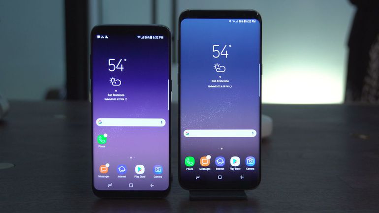
Galaxy S8 builds on Samsung’s heritage of creating stunning designs and meaningful innovations that transform people’s lives. The Infinity Display and bezel-less design give you 18% more screen and form a smooth, continuous surface with no buttons or harsh angles, making multi-tasking more convenient with the 5.8-inch Galaxy S8 and 6.2-inch Galaxy S8+. The physical home key on the front has given way to a more intuitive soft key with a pressure sensor that is embedded under the display.

Despite the significantly larger screens on the Galaxy S8 and Galaxy S8+, the reengineered design with rounded edges and symmetrical sides make them compact and comfortable for one-handed operation. The Corning® Gorilla® Glass 5 on both the front and back provides durability and a high-quality finish.

Mr. HC Hong, President and CEO, Samsung Southwest Asia, said, “With the Galaxy S8 and Galaxy S8+, Samsung is unboxing smartphones that transcend the boundaries of meaningful innovations. Galaxy S8 and Galaxy S8+ extend our trust, our heritage of great innovation and stunning design and our ‘Make for India’ promise.”

Galaxy S8 and Galaxy S8+ come with a defense-grade security platform Samsung Knox. In addition, the smartphones introduce an Iris scanner, which is one of the most secure biometric identification systems on a phone. Galaxy S8 and Galaxy S8+ also offer a choice of biometric technologies including a fingerprint scanner and facial recognition. This is in addition to the traditional options of pin and pattern so that consumers can select a secure authentication method that works best for them.

The devices come integrated with Samsung Pay, Samsung’s mobile payment service which was launched in India recently. With Samsung Pay, the user can turn the Samsung smartphone into a wallet, storing credit and debit cards, Paytm as well as the government’s Unified Payments Interface (UPI) and pay on the go by just tapping the phone on the PoS machine. With Galaxy S8 and Galaxy S8+’s new integrated Iris scanner, fingerprint authentication and Samsung Knox, Samsung Pay will now be infinitely secure.

Samsung Pay now works with Visa, MasterCard, American Express, Axis Bank, HDFC Bank, ICICI Bank, SBI Cards, Citibank and Standard Chartered Bank.

“The stunning Galaxy S8 and Galaxy S8+ come with new design innovations alongside cutting-edge technology that includes a revolutionary camera, the industry’s first 10nm processor, Bixby and robust Phone+ offerings. These devices will offer our consumers a gateway to a new mobile life where the power of innovation will carry them beyond barriers,” said Mr. Asim Warsi, Senior Vice President, Mobile Business, Samsung India.

Galaxy with Infinite Possibilities
Both Galaxy S8 and Galaxy S8+ pack in enhanced performance and features:

Infinite Camera: Galaxy S8 and Galaxy S8+ are equipped with an advanced 8MP front camera with F1.7 lens that is perfect for taking bright and high-resolution selfies even in dimly lit areas. They are the first Galaxy smartphones with a front camera that supports autofocus, which, when combined with the facial recognition technology ensures you get superb selfies even from a distance. The camera also comes with fun stickers and stamps that no social media photo these days is complete without.

Galaxy S8 and Galaxy S8+’s 12MP rear camera utilizes Dual Pixel technology for incredibly fast autofocus. Now you can clearly capture moving objects and will not miss an important moment.
It also has an F1.7 lens to capture bright and crisp photos even in low-light environments.

Infinite Performance: The Galaxy S8 and Galaxy S8+ are powered by the industry first 10nm processor allowing for smooth multi-tasking with 20% less battery consumption than before. 
Now you can experience a seamless and interruption-free experience when playing graphically intensive games.

Infinite Entertainment: As the world’s first mobile device certified by the UHD Alliance as MOBILE HDR PREMIUMTM, Galaxy S8 and Galaxy S8+ let you see the same vibrant colours and contrasts that filmmakers intended while watching your favourite shows. Galaxy S8 and Galaxy S8+ also offer next-level gaming experiences with vivid and superior graphic technology, as well as Game Pack, featuring top game titles, including select titles supported by the Vulkan API.

Infinite Convenience
Galaxy S8 and Galaxy S8+ will also come with the foundational Galaxy features that our consumers have come to love, including:
·         IP68 water and dust resistance
·         Hybrid dual SIM slot
·         64GB internal memory with expandable support up to 256GB
·         Always-on display
·         Fast and wireless charging capabilities

New Way to Interact with Your Phone
Galaxy S8 and Galaxy S8+ make life easier for users with Bixby. The intelligent interface helps users get more out of their phone. With the new Bixby button, you will be able to conveniently access Bixby and navigate through services and apps with simple voice, touch and text commands. Contextual awareness capabilities enable Bixby to offer personalized help based on what it continues to learn about the user’s interests, situation and location.

Phone+ Ecosystem
Galaxy S8 and Galaxy S8+ are your gateway to the ‘Galaxy of Possibilities’, Samsung’s ecosystem of devices and software. The new Gear VR with Controller, powered by Oculus, allows you to watch stunning VR videos and play ultrarealistic VR games. Enabling convenient one-handed control and navigation, the controller provides better motion interaction when accessing interactive VR content.

The smartphones will also connect to the new and sleek Gear 360, which redefines how you create and share your memories. It allows you to create 4K 360-degree videos that can be easily shared with people. And complemented with the Gear VR, you can relive precious moments like you are actually there.

Leveraging the processing power of the Galaxy S8 and Galaxy S8+, Samsung DeX offers a unique solution that delivers a PC-like experience allowing users to multi-task, edit presentations, and even watch 4K videos on the big screen.

Availability
The Galaxy S8 will be offered in a rich color palette including Midnight Black and Maple Gold, while the Galaxy S8+ will also get the Coral Blue variant. New high-performance earphones tuned by AKG by Harman, offering uncompromised audio for unbeatable sound quality, will come as an in-box accessory.

Galaxy S8 and Galaxy S8+ will be offered to consumers at a price of INR 57,900 and INR 64,900, respectively. The flagship smartphones will be available in India starting May 5, 2017 across select retail stores. They will be available online exclusively on Samsung Shop and Flipkart.

Consumers can pre-book the Galaxy S8 and Galaxy S8+ from April 19 onwards to avail the special Pre-book Offer of a free Convertible Wireless Charger.

Samsung Galaxy S8 and Galaxy S8+ users will get a Double Data offer on the Jio network. On a monthly recharge of INR 309 users will enjoy 448 GB of 4G data over 8 months. With this Double Data offer Samsung Galaxy S8 users can experience a truly unconstrained Digital Life on Jio’s world-class all-IP data strong only-4G network.

Popular posts from this blog

Radisson Blu Hotel, Dubai Improves Guest Wi-Fi Coverage and Performance with Aruba Wireless Solutions

Radisson Blu Hotel, in Al Sufouh at Dubai Media City has recently deployed wireless infrastructure from Aruba, a Hewlett Packard Enterprise Company, to deliver secure, seamless, high-speed, wireless internet connectivity across its hotel rooms, suites and public areas. The implementation has resulted in improvement in rating of Wi-Fi services and drastic reduction in volume of IT help desk calls, besides the fact that the design of the Access Points (APs) blends seamlessly with the hotel aesthetics and AP management, monitoring and troubleshooting has become centralized and simplified.

Pure Storage Expands Collaboration with Cisco and Enhances FlashStack Converged Infrastructure Portfolio

Pure Storage announced that the company is expanding its FlashStack Converged Infrastructure Solution with Cisco, which makes it easier for customers to deploy, expand and maintain FlashStack solutions. With thousands of deployments in over 30 countries around the world, this proven solution continues to see triple digit growth year over year.

Amazon.in launches “Smart Living Store”

How would it be if you could stream online videos or browse websites on your TV? How about a device that could measure your level of activity throughout the day? How would it be if a device helps keep your home secure? With the Smart Living Store you can find out! Amazon.in announces the launch of “Smart Living Store” - a dedicated store aimed at providing customers the one stop shop for all smart devices across various product categories.