/*! normalize.css v3.0.1 | MIT License | git.io/normalize */html{font-family:sans-serif;-ms-text-size-adjust:100%;-webkit-text-size-adjust:100%}body{margin:0}article,aside,details,figcaption,figure,footer,header,hgroup,main,nav,section,summary{display:block}audio,canvas,progress,video{display:inline-block;vertical-align:baseline}audio:not([controls]){display:none;height:0}[hidden],template{display:none}a{background:transparent}a:active,a:hover{outline:0}abbr[title]{border-bottom:1px dotted}b,strong{font-weight:bold}dfn{font-style:italic}h1{font-size:2em;margin:.67em 0}mark{background:#ff0;color:#000}small{font-size:80%}sub,sup{font-size:75%;line-height:0;position:relative;vertical-align:baseline}sup{top:-0.5em}sub{bottom:-0.25em}img{border:0}svg:not(:root){overflow:hidden}figure{margin:1em 40px}hr{-moz-box-sizing:content-box;box-sizing:content-box;height:0}pre{overflow:auto}code,kbd,pre,samp{font-family:monospace,monospace;font-size:1em}button,input,optgroup,select,textarea{color:inherit;font:inherit;margin:0}button{overflow:visible}button,select{text-transform:none}button,html input[type="button"],input[type="reset"],input[type="submit"]{-webkit-appearance:button;cursor:pointer}button[disabled],html input[disabled]{cursor:default}button::-moz-focus-inner,input::-moz-focus-inner{border:0;padding:0}input{line-height:normal}input[type="checkbox"],input[type="radio"]{box-sizing:border-box;padding:0}input[type="number"]::-webkit-inner-spin-button,input[type="number"]::-webkit-outer-spin-button{height:auto}input[type="search"]{-webkit-appearance:textfield;-moz-box-sizing:content-box;-webkit-box-sizing:content-box;box-sizing:content-box}input[type="search"]::-webkit-search-cancel-button,input[type="search"]::-webkit-search-decoration{-webkit-appearance:none}fieldset{border:1px solid #c0c0c0;margin:0 2px;padding:.35em .625em .75em}legend{border:0;padding:0}textarea{overflow:auto}optgroup{font-weight:bold}table{border-collapse:collapse;border-spacing:0}td,th{padding:0} .skip-navigation { background-color: #fff; box-sizing: border-box; color: #000; display: block; height: 0; left: 0; line-height: 50px; overflow: hidden; padding-top: 0; position: fixed; text-align: center; top: 0; -webkit-transition: box-shadow .3s , height .3s , padding-top .3s; transition: box-shadow .3s , height .3s , padding-top .3s; width: 100%; z-index: 900; } .skip-navigation:focus { box-shadow: 0 4px 5px 0 rgba(0,0,0,0.14) , 0 1px 10px 0 rgba(0,0,0,0.12) , 0 2px 4px -1px rgba(0,0,0,0.2); height: 50px; } #main { outline: none; } body { overflow-wrap: break-word; word-break: break-word; word-wrap: break-word; } .hidden { display: none; } .invisible { visibility: hidden; } .container:after, .float-container:after { clear: both; content: ""; display: table; } .clearboth { clear: both; } .dim-overlay { background-color: rgba(0,0,0,0.54); height: 100vh; left: 0; position: fixed; top: 0; width: 100%; } #sharing-dim-overlay { background-color: transparent; } .main-heading { position: absolute; clip: rect(1px,1px,1px,1px); padding: 0; border: 0; height: 1px; width: 1px; overflow: hidden; } .loading-spinner-large { -webkit-animation: mspin-rotate 1568.63ms infinite linear; animation: mspin-rotate 1568.63ms infinite linear; height: 48px; overflow: hidden; position: absolute; width: 48px; z-index: 200; } .loading-spinner-large>div { -webkit-animation: mspin-revrot 5332ms infinite steps(4); animation: mspin-revrot 5332ms infinite steps(4); } .loading-spinner-large>div>div { -webkit-animation: mspin-singlecolor-large-film 1333ms infinite steps(81); animation: mspin-singlecolor-large-film 1333ms infinite steps(81); background-size: 100%; height: 48px; width: 3888px; } .mspin-black-large>div>div, .mspin-grey_54-large>div>div { background-image: url(../../indie/mspin_black_large.svg); } .mspin-white-large>div>div { background-image: url(../../indie/mspin_white_large.svg); } .mspin-grey_54-large { opacity: .54; } @-webkit-keyframes mspin-singlecolor-large-film { 0% { -webkit-transform: translateX(0); transform: translateX(0); } to { -webkit-transform: translateX(-3888px); transform: translateX(-3888px); } } @keyframes mspin-singlecolor-large-film { 0% { -webkit-transform: translateX(0); transform: translateX(0); } to { -webkit-transform: translateX(-3888px); transform: translateX(-3888px); } } @-webkit-keyframes mspin-rotate { 0% { -webkit-transform: rotate(0deg); transform: rotate(0deg); } to { -webkit-transform: rotate(360deg); transform: rotate(360deg); } } @keyframes mspin-rotate { 0% { -webkit-transform: rotate(0deg); transform: rotate(0deg); } to { -webkit-transform: rotate(360deg); transform: rotate(360deg); } } @-webkit-keyframes mspin-revrot { 0% { -webkit-transform: rotate(0deg); transform: rotate(0deg); } to { -webkit-transform: rotate(-360deg); transform: rotate(-360deg); } } @keyframes mspin-revrot { 0% { -webkit-transform: rotate(0deg); transform: rotate(0deg); } to { -webkit-transform: rotate(-360deg); transform: rotate(-360deg); } } input::-ms-clear { display: none; } .blogger-logo, .svg-icon-24.blogger-logo { fill: #ff9800; opacity: 1; } .widget.Attribution { margin-top: 1em; text-align: center; } .widget.Attribution .blogger img, .widget.Attribution .blogger svg { vertical-align: bottom; } .widget.Attribution .blogger img { margin-right: .5em; } .widget.Attribution div { line-height: 24px; margin-top: .5em; } .widget.Attribution .image-attribution, .widget.Attribution .copyright { font-size: .7em; margin-top: 1.5em; } .item-control { display: none; } .BLOG_mobile_video_class { display: none; } .bg-photo { background-attachment: scroll !important; } body .CSS_LIGHTBOX { z-index: 900; } .extendable .show-more, .extendable .show-less { border-color: #25a186; color: #25a186; margin-top: 8px; } .extendable .show-more.hidden, .extendable .show-less.hidden { display: none; } .inline-ad { display: none; max-width: 100%; overflow: hidden; } .adsbygoogle { display: block; } #cookieChoiceInfo { bottom: 0; top: auto; } iframe.b-hbp-video { border: none; } .post-body img { max-width: 100%; } .post-body iframe { max-width: 100%; } .post-body a[imageanchor="1"] { display: inline-block; } .byline { margin-right: 1em; } .byline:last-child { margin-right: 0; } .paging-control-container { margin-bottom: 16px; } .paging-control-container .paging-control { display: inline-block; } .paging-control-container .paging-control, .paging-control-container .comment-range-text:after { color: #25a186; } .paging-control-container .paging-control, .paging-control-container .comment-range-text { margin-right: 8px; } .paging-control-container .comment-range-text:after, .paging-control-container .paging-control:after { content: "\b7"; cursor: default; pointer-events: none; } .paging-control-container .comment-range-text:last-child:after, .paging-control-container .paging-control:last-child:after { content: none; } .paging-control-container .comment-range-text:after, .paging-control-container .paging-control:after { padding-left: 8px; } .byline.reactions iframe { height: 20px; } .b-notification { color: #000; background-color: white; border-bottom: solid 1px #000; box-sizing: border-box; padding: 16px 32px; text-align: center; } .b-notification.visible { -webkit-transition: margin-top .3s cubic-bezier(0.4,0.0,0.2,1); transition: margin-top .3s cubic-bezier(0.4,0.0,0.2,1); } .b-notification.invisible { position: absolute; } .b-notification-close { position: absolute; right: 8px; top: 8px; } .no-posts-message { line-height: 40px; text-align: center; } @media screen and (max-width: 968px) { body.item-view .post-body a[imageanchor="1"][style*="float: left;"], body.item-view .post-body a[imageanchor="1"][style*="float: right;"] { float: none !important; clear: none !important; } body.item-view .post-body a[imageanchor="1"] img { display: block; height: auto; margin: 0 auto; } body.item-view .post-body a[imageanchor="1"][style*="float: left;"] img, body.item-view .post-body .separator[style*="text-align: left"] a[imageanchor="1"] img { margin: 0 auto 0 0; } body.item-view .post-body a[imageanchor="1"][style*="float: right;"] img, body.item-view .post-body .separator[style*="text-align: right"] a[imageanchor="1"] img { margin: 0 0 0 auto; } .post-body a[imageanchor] { display: block; } body.item-view .post-body a[imageanchor="1"] { margin-left: 0 !important; margin-right: 0 !important; } body.item-view .post-body a[imageanchor="1"]+a[imageanchor="1"] { margin-top: 16px; } } #comments { border-top: 1px dashed rgba(0,0,0,0.54); margin-top: 20px; padding: 20px; } #comments .comment-thread ol { margin: 0; padding-left: 0; } #comments .comment-thread ol { padding-left: 0; } #comments .comment-thread .comment-replies, #comments .comment .comment-replybox-single { margin-left: 60px; } #comments .comment-thread .thread-count { display: none; } #comments .comment { list-style-type: none; padding: 0 0 30px; position: relative; } #comments .comment .comment { padding-bottom: 8px; } .comment .avatar-image-container { position: absolute; } .comment .avatar-image-container img { border-radius: 50%; } .avatar-image-container svg, .comment .avatar-image-container .avatar-icon { border-radius: 50%; border: solid 1px #25a186; box-sizing: border-box; fill: #25a186; height: 35px; margin: 0; padding: 7px; width: 35px; } .comment .comment-block { margin-top: 10px; padding-bottom: 0; } .comment .comment-block { margin-left: 60px; } #comments .comment-author-header-wrapper { margin-left: 40px; } #comments .comment .thread-expanded .comment-block { padding-bottom: 20px; } #comments .comment .comment-header .user, #comments .comment .comment-header .user a { color: #292929; font-style: normal; font-weight: bold; } #comments .comment .comment-actions { background: transparent; border: none; box-shadow: none; color: #25a186; cursor: pointer; font-size: 14px; font-weight: bold; outline: none; text-decoration: none; text-transform: uppercase; width: auto; bottom: 0; margin-bottom: 15px; position: absolute; } #comments .comment .comment-actions>* { margin-right: 8px; } #comments .comment .comment-header .datetime { bottom: 0; color: rgba(0,0,0,0.54); display: inline-block; font-size: 13px; font-style: italic; } #comments .comment .comment-header .datetime { margin-left: 8px; } #comments .comment .comment-header .datetime a, #comments .comment .comment-footer .comment-timestamp a { color: rgba(0,0,0,0.54); } .comment .comment-body, #comments .comment .comment-content { margin-top: 12px; word-break: break-word; } .comment-body { margin-bottom: 12px; } #comments.embed[data-num-comments="0"] { border: none; margin-top: 0; padding-top: 0; } #comments.embed[data-num-comments="0"] #comment-post-message, #comments.embed[data-num-comments="0"] div.comment-form>p, #comments.embed[data-num-comments="0"] p.comment-footer { display: none; } #comment-editor-src { display: none; } .comments .comments-content .loadmore.loaded { max-height: 0; opacity: 0; overflow: hidden; } .extendable .remaining-items { height: 0; overflow: hidden; -webkit-transition: height .3s cubic-bezier(0.4,0.0,0.2,1); transition: height .3s cubic-bezier(0.4,0.0,0.2,1); } .extendable .remaining-items.expanded { height: auto; } .svg-icon-24, .svg-icon-24-button { cursor: pointer; height: 24px; width: 24px; min-width: 24px; } .touch-icon { margin: -12px; padding: 12px; } html[dir=rtl] .rtl-reversible-icon { -webkit-transform: scaleX(-1); -ms-transform: scaleX(-1); transform: scaleX(-1); } svg:not(:root).touch-icon { overflow: visible; } .touch-icon:focus, .touch-icon:active { background-color: rgba(153,153,153,.4); border-radius: 50%; } .touch-icon-button, .svg-icon-24-button { background: transparent; border: none; margin: 0; outline: none; padding: 0; } .touch-icon-button .touch-icon:focus, .touch-icon-button .touch-icon:active { background-color: transparent; } .touch-icon-button:focus .touch-icon, .touch-icon-button:active .touch-icon { background-color: rgba(153,153,153,.4); border-radius: 50%; } .widget.Profile .default-avatar-wrapper .avatar-icon { border-radius: 50%; border: solid 1px #000000; box-sizing: border-box; fill: #000000; margin: 0; } .widget.Profile .individual .profile-img, .widget.Profile .individual .avatar-icon { height: 120px; width: 120px; } .widget.Profile .team .profile-img, .widget.Profile .team .avatar-icon, .widget.Profile .team .default-avatar-wrapper { height: 40px; width: 40px; } .widget.Profile .individual .default-avatar-wrapper .avatar-icon { padding: 25px; } .widget.Profile .team .default-avatar-wrapper .avatar-icon { padding: 8px; } .snippet-container { margin: 0; position: relative; overflow: hidden; } .snippet-fade { bottom: 0; box-sizing: border-box; position: absolute; width: 96px; } .snippet-fade { right: 0; } .snippet-fade:after { content: '\2026'; } .snippet-fade:after { float: right; } .post-bottom { -webkit-box-align: center; -webkit-align-items: center; -ms-flex-align: center; align-items: center; display: -webkit-box; display: -webkit-flex; display: -ms-flexbox; display: flex; -webkit-flex-wrap: wrap; -ms-flex-wrap: wrap; flex-wrap: wrap; } .post-footer { -webkit-box-flex: 1; -webkit-flex: 1 1 auto; -ms-flex: 1 1 auto; flex: 1 1 auto; -webkit-flex-wrap: wrap; -ms-flex-wrap: wrap; flex-wrap: wrap; -webkit-box-ordinal-group: 2; -webkit-order: 1; -ms-flex-order: 1; order: 1; } .post-footer>* { -webkit-box-flex: 0; -webkit-flex: 0 1 auto; -ms-flex: 0 1 auto; flex: 0 1 auto; } .post-footer .byline:last-child { margin-right: 1em; } .jump-link { -webkit-box-flex: 0; -webkit-flex: 0 0 auto; -ms-flex: 0 0 auto; flex: 0 0 auto; -webkit-box-ordinal-group: 3; -webkit-order: 2; -ms-flex-order: 2; order: 2; } .centered-top-container.sticky { left: 0; position: fixed; right: 0; top: 0; width: auto; z-index: 8; -webkit-transition-property: opacity , -webkit-transform; transition-property: opacity , -webkit-transform; transition-property: transform , opacity; transition-property: transform , opacity , -webkit-transform; -webkit-transition-duration: .2s; transition-duration: .2s; -webkit-transition-timing-function: cubic-bezier(0.4,0.0,0.2,1); transition-timing-function: cubic-bezier(0.4,0.0,0.2,1); } .centered-top-placeholder { display: none; } .collapsed-header .centered-top-placeholder { display: block; } .centered-top-container .Header .replaced h1, .centered-top-placeholder .Header .replaced h1 { display: none; } .centered-top-container.sticky .Header .replaced h1 { display: block; } .centered-top-container.sticky .Header .header-widget { background: none; } .centered-top-container.sticky .Header .header-image-wrapper { display: none; } .centered-top-container img, .centered-top-placeholder img { max-width: 100%; } .collapsible { -webkit-transition: height .3s cubic-bezier(0.4,0.0,0.2,1); transition: height .3s cubic-bezier(0.4,0.0,0.2,1); } .collapsible, .collapsible>summary { display: block; overflow: hidden; } .collapsible>:not(summary) { display: none; } .collapsible[open]>:not(summary) { display: block; } .collapsible:focus, .collapsible>summary:focus { outline: none; } .collapsible>summary { cursor: pointer; display: block; padding: 0; } .collapsible:focus>summary, .collapsible>summary:focus { background-color: transparent; } .collapsible>summary::-webkit-details-marker { display: none; } .collapsible-title { -webkit-box-align: center; -webkit-align-items: center; -ms-flex-align: center; align-items: center; display: -webkit-box; display: -webkit-flex; display: -ms-flexbox; display: flex; } .collapsible-title .title { -webkit-box-flex: 1; -webkit-flex: 1 1 auto; -ms-flex: 1 1 auto; flex: 1 1 auto; -webkit-box-ordinal-group: 1; -webkit-order: 0; -ms-flex-order: 0; order: 0; overflow: hidden; text-overflow: ellipsis; white-space: nowrap; } .collapsible-title .chevron-down, .collapsible[open] .collapsible-title .chevron-up { display: block; } .collapsible-title .chevron-up, .collapsible[open] .collapsible-title .chevron-down { display: none; } .overflowable-container { max-height: 48px; overflow: hidden; position: relative; } .overflow-button { cursor: pointer; } #overflowable-dim-overlay { background: transparent; } .overflow-popup { box-shadow: 0 2px 2px 0 rgba(0,0,0,.14) , 0 3px 1px -2px rgba(0,0,0,.2) , 0 1px 5px 0 rgba(0,0,0,.12); background-color: #ffffff; left: 0; max-width: calc(100% - 32px); position: absolute; top: 0; visibility: hidden; z-index: 101; } .overflow-popup ul { list-style: none; } .overflow-popup li, .overflow-popup .tabs li { display: block; height: auto; } .overflow-popup .tabs li { padding-left: 0; padding-right: 0; } .overflow-button.hidden, .overflow-popup li.hidden, .overflow-popup .tabs li.hidden { display: none; } .ripple { position: relative; } .ripple>* { z-index: 1; } .splash-wrapper { bottom: 0; left: 0; overflow: hidden; pointer-events: none; position: absolute; right: 0; top: 0; z-index: 0; } .splash { background: hsl(0,0%,80%); border-radius: 100%; display: block; opacity: .6; position: absolute; -webkit-transform: scale(0); -ms-transform: scale(0); transform: scale(0); } .splash.animate { -webkit-animation: ripple-effect .4s linear; animation: ripple-effect .4s linear; } @-webkit-keyframes ripple-effect { to { opacity: 0; -webkit-transform: scale(2.5); transform: scale(2.5); } } @keyframes ripple-effect { to { opacity: 0; -webkit-transform: scale(2.5); transform: scale(2.5); } } .search { display: -webkit-box; display: -webkit-flex; display: -ms-flexbox; display: flex; line-height: 24px; width: 24px; } .search form { z-index: 101; } .search h3 { display: none; } .search.focused { width: 100%; } .search.focused .section { width: 100%; } .search-expand { -webkit-box-flex: 0; -webkit-flex: 0 0 auto; -ms-flex: 0 0 auto; flex: 0 0 auto; } .search-expand-text { display: none; } .search-close { display: inline; vertical-align: middle; } .search form { display: -webkit-box; display: -webkit-flex; display: -ms-flexbox; display: flex; -webkit-box-flex: 1; -webkit-flex: 1 0 0; -ms-flex: 1 0 0px; flex: 1 0 0; border-bottom: solid 1px transparent; padding-bottom: 8px; } .search form>* { display: none; } .search.focused form>* { display: block; } .search .search-input label { display: none; } .centered-top-placeholder.cloned .search form { z-index: 30; } .search.focused form { border-color: #292929; position: relative; width: auto; } .collapsed-header .centered-top-container .search.focused form { border-bottom-color: transparent; } .search-input { -webkit-box-flex: 1; -webkit-flex: 1 0 1px; -ms-flex: 1 0 1px; flex: 1 0 1px; } .search-input input { background: none; border: none; box-sizing: border-box; color: #292929; display: inline-block; outline: none; width: calc(100% - 48px); } .search-input input.no-cursor { color: transparent; text-shadow: 0 0 0 #292929; } .collapsed-header .centered-top-container .search-action, .collapsed-header .centered-top-container .search-input input { color: #292929; } .collapsed-header .centered-top-container .search-input input.no-cursor { color: transparent; text-shadow: 0 0 0 #292929; } .search-input input.no-cursor:focus, .collapsed-header .centered-top-container .search-input input.no-cursor:focus { outline: none; } .search-focused>* { visibility: hidden; } .search-focused .search, .search-focused .search-icon { visibility: visible; } .search.focused .search-action { display: block; } .search.focused .search-action:disabled { opacity: .3; } .sidebar-container { background-color: #f7f7f7; max-width: 320px; overflow-y: auto; -webkit-transition-property: -webkit-transform; transition-property: -webkit-transform; transition-property: transform; transition-property: transform, -webkit-transform; -webkit-transition-duration: .3s; transition-duration: .3s; -webkit-transition-timing-function: cubic-bezier(0.0,0.0,0.2,1); transition-timing-function: cubic-bezier(0.0,0.0,0.2,1); width: 320px; z-index: 101; -webkit-overflow-scrolling: touch; } .sidebar-container .navigation { line-height: 0; padding: 20px; } .sidebar-container .widget { background: none; margin: 0 16px; padding: 1em 0; } .sidebar-container .widget .title { color: #000000; margin: 0; } .sidebar-container .widget ul { list-style: none; margin: 0; padding: 0; } .sidebar-container .widget ul ul { margin-left: 1em; } .sidebar-container .widget ul li { font-size: 16px; line-height: normal; } .BlogArchive li { margin: 16px 0; } .BlogArchive li:last-child { margin-bottom: 0; } .Label .label-count:before, .BlogArchive .post-count:before { content: '('; } .Label .label-count:after, .BlogArchive .post-count:after { content: ')'; } .Label .label-count, .BlogArchive .post-count { float: right; margin-left: .25em; } .Label li a { display: inline-block; } .widget.Translate .skiptranslate>div { display: block !important; } .widget.Profile .profile-link { background-image: none !important; display: -webkit-box; display: -webkit-flex; display: -ms-flexbox; display: flex; } .widget.Profile .team-member .profile-img, .widget.Profile .team-member .default-avatar-wrapper { -webkit-box-flex: 0; -webkit-flex: 0 0 auto; -ms-flex: 0 0 auto; flex: 0 0 auto; } .widget.Profile .team-member .profile-img, .widget.Profile .team-member .default-avatar-wrapper { margin-right: 1em; } .widget.Profile .individual .profile-link { -webkit-box-orient: vertical; -webkit-box-direction: normal; -webkit-flex-direction: column; -ms-flex-direction: column; flex-direction: column; } .widget.Profile .team .profile-link .profile-name { -webkit-align-self: center; -ms-flex-item-align: center; -ms-grid-row-align: center; align-self: center; display: block; -webkit-box-flex: 1; -webkit-flex: 1 1 auto; -ms-flex: 1 1 auto; flex: 1 1 auto; } .sidebar-container .sidebar-back { cursor: pointer; } .sidebar-container .widget+.widget { border-top: 1px dashed #000000; } .dim-overlay { background-color: rgba(0,0,0,0.54); z-index: 100; } body.sidebar-visible { overflow-y: hidden; } @media screen and (max-width: 1619px) { .sidebar-container { bottom: 0; position: fixed; top: 0; } .sidebar-container { left: auto; right: 0; } .sidebar-container.sidebar-invisible { -webkit-transition-timing-function: cubic-bezier(0.4,0.0,0.6,1); transition-timing-function: cubic-bezier(0.4,0.0,0.6,1); } .sidebar-container.sidebar-invisible { -webkit-transform: translateX(320px); -ms-transform: translateX(320px); transform: translateX(320px); } } .dialog { box-shadow: 0 2px 2px 0 rgba(0,0,0,.14) , 0 3px 1px -2px rgba(0,0,0,.2) , 0 1px 5px 0 rgba(0,0,0,.12); background: #ffffff; box-sizing: border-box; padding: 30px; position: fixed; text-align: center; width: calc(100% - 24px); z-index: 101; } .dialog input[type=text], .dialog input[type=email] { background-color: transparent; border-bottom: solid 1px rgba(41,41,41,0.12); border-left: none; border-right: none; border-top: none; color: #292929; display: block; font-family: Lora, serif; font-size: 16px; line-height: 24px; margin: auto; padding-bottom: 7px; outline: none; text-align: center; width: 100%; } .dialog input[type=text]::-webkit-input-placeholder, .dialog input[type=email]::-webkit-input-placeholder { color: #292929; } .dialog input[type=text]::-moz-placeholder, .dialog input[type=email]::-moz-placeholder { color: #292929; } .dialog input[type=text]:-ms-input-placeholder, .dialog input[type=email]:-ms-input-placeholder { color: #292929; } .dialog input[type=text]::placeholder, .dialog input[type=email]::placeholder { color: #292929; } .dialog input[type=text]:focus, .dialog input[type=email]:focus { border-bottom: solid 2px #25a186; padding-bottom: 6px; } .dialog input[type=submit] { font-family: Lora, serif; } .dialog input.no-cursor { color: transparent; text-shadow: 0 0 0 #292929; } .dialog input.no-cursor:focus { outline: none; } .subscribe-popup { max-width: 364px; } .subscribe-popup h3 { color: #ffffff; font-size: 1.8em; margin-top: 0; } .subscribe-popup div.widget.FollowByEmail h3 { display: none; } .subscribe-popup div.widget.FollowByEmail .follow-by-email-submit { background: transparent; border: none; box-shadow: none; color: #25a186; cursor: pointer; font-size: 14px; font-weight: bold; outline: none; text-decoration: none; text-transform: uppercase; width: auto; color: #25a186; display: inline-block; margin: 0 auto; margin-top: 24px; width: auto; white-space: normal; } .subscribe-popup div.widget.FollowByEmail .follow-by-email-submit:disabled { cursor: default; opacity: .3; } @media (max-width:800px) { .blog-name div.widget.Subscribe { margin-bottom: 16px; } body.item-view .blog-name div.widget.Subscribe { margin: 8px auto 16px; width: 100%; } } body#layout .bg-photo-overlay, body#layout .bg-photo { display: none; } body#layout .page_body { padding: 0; position: relative; top: 0; } body#layout .page { display: inline-block; left: inherit; position: relative; vertical-align: top; width: 540px; } body#layout .centered { max-width: 954px; } body#layout .navigation { display: none; } body#layout .sidebar-container { display: inline-block; width: 40%; } body#layout .hamburger-menu, body#layout .search { display: none; } .widget.Sharing .sharing-button { display: none; } .widget.Sharing .sharing-buttons li { padding: 0; } .widget.Sharing .sharing-buttons li span { display: none; } .post-share-buttons { position: relative; } .share-buttons .svg-icon-24, .centered-bottom .share-buttons .svg-icon-24 { fill: #25a186; } .sharing-open.touch-icon-button:focus .touch-icon, .sharing-open.touch-icon-button:active .touch-icon { background-color: transparent; } .share-buttons { background-color: #ffffff; border-radius: 2px; box-shadow: 0 2px 2px 0 rgba(0,0,0,.14) , 0 3px 1px -2px rgba(0,0,0,.2) , 0 1px 5px 0 rgba(0,0,0,.12); color: #25a186; list-style: none; margin: 0; padding: 8px 0; position: absolute; top: -11px; min-width: 200px; z-index: 101; } .share-buttons.hidden { display: none; } .sharing-button { background: transparent; border: none; margin: 0; outline: none; padding: 0; cursor: pointer; } .share-buttons li { margin: 0; height: 48px; } .share-buttons li:last-child { margin-bottom: 0; } .share-buttons li .sharing-platform-button { box-sizing: border-box; cursor: pointer; display: block; height: 100%; margin-bottom: 0; padding: 0 16px; position: relative; width: 100%; } .share-buttons li .sharing-platform-button:focus, .share-buttons li .sharing-platform-button:hover { background-color: rgba(128,128,128,0.1); outline: none; } .share-buttons li svg[class^="sharing-"], .share-buttons li svg[class*=" sharing-"] { position: absolute; top: 10px; } .share-buttons li span.sharing-platform-button, .share-buttons li span.sharing-platform-button { position: relative; top: 0; } .share-buttons li .platform-sharing-text { display: block; font-size: 16px; line-height: 48px; white-space: nowrap; } .share-buttons li .platform-sharing-text { margin-left: 56px; } .flat-button { cursor: pointer; display: inline-block; font-weight: bold; text-transform: uppercase; border-radius: 2px; padding: 8px; margin: -8px; } .flat-icon-button { background: transparent; border: none; margin: 0; outline: none; padding: 0; margin: -12px; padding: 12px; cursor: pointer; box-sizing: content-box; display: inline-block; line-height: 0; } .flat-icon-button, .flat-icon-button .splash-wrapper { border-radius: 50%; } .flat-icon-button .splash.animate { -webkit-animation-duration: .3s; animation-duration: .3s; } h1, h2, h3, h4, h5, h6 { margin: 0; } .post-body h1, .post-body h2, .post-body h3, .post-body h4, .post-body h5, .post-body h6 { margin: 1em 0; } a, .action-link { color: #25a186; cursor: pointer; text-decoration: none; } a:visited, .action-link:visited { color: #25a186; } a:hover, .action-link:hover { color: #25a186; } body { background-color: #ffffff; color: #292929; font: 400 20px Lora, serif; } .unused { background: #ffffff none repeat scroll top left; } .dim-overlay { z-index: 100; } body { margin: 0 auto; } .all-container { min-height: 100vh; display: -webkit-box; display: -webkit-flex; display: -ms-flexbox; display: flex; -webkit-box-orient: vertical; -webkit-box-direction: normal; -webkit-flex-direction: column; -ms-flex-direction: column; flex-direction: column; } body.sidebar-visible .all-container { overflow-y: scroll; } .page { max-width: 1280px; width: 100%; } .Blog { padding: 0; padding-left: 136px; } .main_content_container { -webkit-box-flex: 0; -webkit-flex: 0 0 auto; -ms-flex: 0 0 auto; flex: 0 0 auto; margin: 0 auto; max-width: 1600px; width: 100%; } .centered-top-container { -webkit-box-flex: 0; -webkit-flex: 0 0 auto; -ms-flex: 0 0 auto; flex: 0 0 auto; } .centered-top, .centered-top-placeholder { box-sizing: border-box; width: 100%; } .centered-top { box-sizing: border-box; margin: 0 auto; max-width: 1280px; padding: 44px 136px 32px; width: 100%; } .centered { width: 100%; } .centered-top-firstline { display: -webkit-box; display: -webkit-flex; display: -ms-flexbox; display: flex; position: relative; width: 100%; } .main_header_elements { display: -webkit-box; display: -webkit-flex; display: -ms-flexbox; display: flex; -webkit-box-flex: 0; -webkit-flex: 0 1 auto; -ms-flex: 0 1 auto; flex: 0 1 auto; -webkit-box-ordinal-group: 2; -webkit-order: 1; -ms-flex-order: 1; order: 1; overflow-x: hidden; width: 100%; } html[dir=rtl] .main_header_elements { -webkit-box-ordinal-group: 3; -webkit-order: 2; -ms-flex-order: 2; order: 2; } body.search-view .centered-top.search-focused .blog-name { display: none; } .widget.Header img { max-width: 100%; } .blog-name { -webkit-box-flex: 1; -webkit-flex: 1 1 auto; -ms-flex: 1 1 auto; flex: 1 1 auto; min-width: 0; -webkit-box-ordinal-group: 2; -webkit-order: 1; -ms-flex-order: 1; order: 1; } .subscribe-section-container { -webkit-box-flex: 0; -webkit-flex: 0 0 auto; -ms-flex: 0 0 auto; flex: 0 0 auto; -webkit-box-ordinal-group: 3; -webkit-order: 2; -ms-flex-order: 2; order: 2; } .search { -webkit-box-flex: 0; -webkit-flex: 0 0 auto; -ms-flex: 0 0 auto; flex: 0 0 auto; -webkit-box-ordinal-group: 4; -webkit-order: 3; -ms-flex-order: 3; order: 3; line-height: 24px; } .search svg { margin-bottom: 0px; margin-top: 0px; padding-bottom: 0; padding-top: 0; } .search, .search.focused { display: block; width: auto; } .search .section { position: absolute; right: 0; top: 0; } .search-expand { background: transparent; border: none; margin: 0; outline: none; padding: 0; display: block; } .search.focused .search-expand { visibility: hidden; } .hamburger-menu { float: right; height: 24px; } .subscribe-section-container, .search-expand { margin-left: 44px; } .hamburger-section { -webkit-box-flex: 1; -webkit-flex: 1 0 auto; -ms-flex: 1 0 auto; flex: 1 0 auto; margin-left: 44px; -webkit-box-ordinal-group: 3; -webkit-order: 2; -ms-flex-order: 2; order: 2; } html[dir=rtl] .hamburger-section { -webkit-box-ordinal-group: 2; -webkit-order: 1; -ms-flex-order: 1; order: 1; } .search-expand-icon { display: none; } .search-expand-text { display: block; } .search-input { width: 100%; } .search-focused .hamburger-section { visibility: visible; } .centered-top-secondline .PageList ul { margin: 0; max-height: 288px; overflow-y: hidden; } .centered-top-secondline .PageList .overflow-popup ul { overflow-y: auto; } .overflowable-contents li { display: inline-block; height: 48px; } .centered-top-secondline .widget.PageList .overflow-popup li { display: block; } .centered-top-secondline .widget.PageList .overflow-popup li.hidden { display: none; } .centered-top-secondline .PageList li { margin-right: 30px; } .centered-top-secondline .PageList li a, .centered-top-secondline .PageList .overflow-button a { padding: 12px; } .centered-top-secondline .PageList li:first-child a { padding-left: 0; } .sticky .blog-name { overflow: hidden; } .sticky .blog-name .widget.Header h1 { overflow: hidden; text-overflow: ellipsis; white-space: nowrap; } .sticky .blog-name .widget.Header p, .sticky .centered-top-secondline { display: none; } .centered-top-container, .centered-top-placeholder { background: #ffffff none repeat scroll top left; } .centered-top .svg-icon-24 { fill: #25a186; } .blog-name { -webkit-transition: opacity .2s cubic-bezier(0.4,0.0,0.2,1); transition: opacity .2s cubic-bezier(0.4,0.0,0.2,1); } .blog-name h1, .blog-name h1 a { color: #000000; font: 700 24px Open Sans, sans-serif; line-height: 24px; text-transform: uppercase; } .widget.Header .header-widget p { font: 400 14px Open Sans, sans-serif; font-style: italic; color: rgba(0,0,0,0.54); line-height: 1.6; max-width: 676px; } .centered-top .flat-button { color: #25a186; cursor: pointer; font: 600 14px Open Sans, sans-serif; line-height: 24px; text-transform: uppercase; -webkit-transition: opacity .2s cubic-bezier(0.4,0.0,0.2,1); transition: opacity .2s cubic-bezier(0.4,0.0,0.2,1); } .subscribe-button { background: transparent; border: none; margin: 0; outline: none; padding: 0; display: block; } .search .section { opacity: 0; -webkit-transition: opacity .2s cubic-bezier(0.4,0.0,0.2,1); transition: opacity .2s cubic-bezier(0.4,0.0,0.2,1); } html[dir=ltr] .search form { margin-right: 12px; } .search.focused .section { opacity: 1; margin-right: 36px; width: calc(100% - 36px); } .search input { border: 0; color: rgba(0,0,0,0.54); font: 600 16px Open Sans, sans-serif; line-height: 24px; outline: 0; width: 100%; } .search form { padding-bottom: 0; } .search input[type='submit'] { display: none; } .search input::-webkit-input-placeholder { text-transform: uppercase; } .search input::-moz-placeholder { text-transform: uppercase; } .search input:-ms-input-placeholder { text-transform: uppercase; } .search input::placeholder { text-transform: uppercase; } .search .dim-overlay, .centered-top-secondline .dim-overlay { background: transparent; } .centered-top-secondline .PageList li a, .centered-top-secondline .PageList .overflow-button a { color: #25a186; font: 600 14px Open Sans, sans-serif; line-height: 48px; } .centered-top-secondline .PageList li.selected a { color: #25a186; } .centered-top-secondline .overflow-popup .PageList li a { color: #292929; } .PageList ul { padding: 0; } .sticky .search form { border: none; } .sticky { box-shadow: 0 0 20px 0 rgba(0,0,0,0.7); } .sticky .centered-top { padding-bottom: 0; padding-top: 0; } .sticky .centered-top { padding-bottom: 0; padding-top: 0; } .sticky .search, .sticky .search-expand, .sticky .subscribe-button, .sticky .blog-name h1 { line-height: 40px; } .sticky .search-expand, .sticky .search.focused .search-submit, .sticky .hamburger-section { -webkit-box-align: center; -webkit-align-items: center; -ms-flex-align: center; align-items: center; display: -webkit-box; display: -webkit-flex; display: -ms-flexbox; display: flex; height: 40px; } .subscribe-popup h3 { color: rgba(0,0,0,0.84); font: 700 24px Open Sans, sans-serif; margin-bottom: 24px; } .subscribe-popup div.widget.FollowByEmail .follow-by-email-address { color: rgba(0,0,0,0.84); font: 400 14px Open Sans, sans-serif; } .subscribe-popup div.widget.FollowByEmail .follow-by-email-submit { color: #25a186; font: 600 14px Open Sans, sans-serif; margin-top: 24px; } .post-content { -webkit-box-flex: 0; -webkit-flex: 0 1 auto; -ms-flex: 0 1 auto; flex: 0 1 auto; -webkit-box-ordinal-group: 2; -webkit-order: 1; -ms-flex-order: 1; order: 1; max-width: 676px; width: 100%; } .post-content { margin-right: 76px; } .post-filter-message { display: -webkit-box; display: -webkit-flex; display: -ms-flexbox; display: flex; margin: 40px 136px 48px; padding: 10px; position: relative; } .post-filter-message>* { -webkit-box-flex: 0; -webkit-flex: 0 0 auto; -ms-flex: 0 0 auto; flex: 0 0 auto; } .post-filter-message .search-query { font-style: italic; quotes: "\201c" "\201d" "\2018" "\2019"; } .post-filter-message .search-query:before { content: open-quote; } .post-filter-message .search-query:after { content: close-quote; } .post-filter-message div { display: inline-block; } .post-filter-message a { display: inline-block; text-transform: uppercase; } .post-filter-description { -webkit-box-flex: 1; -webkit-flex: 1 1 auto; -ms-flex: 1 1 auto; flex: 1 1 auto; } .post-filter-description { margin-right: 16px; } .post-title { margin-top: 0; } body.feed-view .post-outer-container { margin-top: 85px; } body.feed-view .post-outer-container:first-child, body.feed-view .feed-message+.post-outer-container { margin-top: 0; } .post-outer { display: -webkit-box; display: -webkit-flex; display: -ms-flexbox; display: flex; position: relative; } .post-outer .snippet-thumbnail { -webkit-box-align: center; -webkit-align-items: center; -ms-flex-align: center; align-items: center; background: black; display: -webkit-box; display: -webkit-flex; display: -ms-flexbox; display: flex; -webkit-box-flex: 0; -webkit-flex: 0 0 auto; -ms-flex: 0 0 auto; flex: 0 0 auto; height: 256px; -webkit-box-pack: center; -webkit-justify-content: center; -ms-flex-pack: center; justify-content: center; margin-right: 136px; overflow: hidden; -webkit-box-ordinal-group: 3; -webkit-order: 2; -ms-flex-order: 2; order: 2; position: relative; width: 256px; } .post-outer .thumbnail-empty { background: transparent; } .post-outer .snippet-thumbnail-img { background-position: center; background-repeat: no-repeat; background-size: cover; width: 100%; height: 100%; } .post-outer .snippet-thumbnail img { max-height: 100%; } .post-title-container { margin-bottom: 16px; } .post-body { margin-bottom: 24px; } .post-bottom { display: -webkit-box; display: -webkit-flex; display: -ms-flexbox; display: flex; -webkit-box-pack: justify; -webkit-justify-content: space-between; -ms-flex-pack: justify; justify-content: space-between; } .post-share-buttons-bottom { float: left; } .footer { -webkit-box-flex: 0; -webkit-flex: 0 0 auto; -ms-flex: 0 0 auto; flex: 0 0 auto; margin: auto auto 0; padding-bottom: 32px; width: auto; } .post-header-container { margin-bottom: 12px; } .post-header-container .post-share-buttons-top { float: right; } .post-header-container .post-header { float: left; } .byline { display: inline-block; margin-bottom: 8px; } .byline, .byline a, .flat-button { color: #25a186; font: 600 14px Open Sans, sans-serif; } .flat-button.ripple .splash { background-color: rgba(37,161,134,0.4); } .flat-button.ripple:hover { background-color: rgba(37,161,134,0.12); } .post-footer .byline { text-transform: uppercase; } .cmt_count_iframe_holder { float: left; margin-right: 24px !important; } .post-comment-link { line-height: 1; } .feed-message { margin-bottom: 52px; } .blog-pager { margin-top: 48px; } .blog-pager { float: right; margin-right: 468px; } .FeaturedPost { margin-bottom: 56px; } .FeaturedPost h3 { margin: 16px 136px 8px; } .shown-ad { margin-bottom: 85px; margin-top: 85px; } .shown-ad .inline-ad { display: block; max-width: 676px; } body.feed-view .shown-ad:last-child { display: none; } .post-filter-message { background-color: #25a186; color: #ffffff; font: 600 16px Open Sans, sans-serif; } .post-filter-message a { color: #ffffff; } .post-title, .post-title a { color: #25a186; font: 700 36px Open Sans, sans-serif; line-height: 1.33333333; } .feed-message { color: rgba(0,0,0,0.54); font: 600 16px Open Sans, sans-serif; } .post-header-container .byline, .post-header-container .byline a { color: rgba(0,0,0,0.54); font: 600 16px Open Sans, sans-serif; } .post-header-container .byline.post-author:not(:last-child):after { content: "\b7"; } .post-header-container .byline.post-author:not(:last-child) { margin-right: 0; } .post-snippet-container { font: 400 20px Lora, serif; } .sharing-button { text-transform: uppercase; word-break: normal; } .post-outer-container .svg-icon-24 { fill: #25a186; } .post-body { color: rgba(0,0,0,0.84); font: 400 20px Lora, serif; line-height: 2; } .blog-pager .blog-pager-older-link { color: #25a186; float: right; font: 600 14px Open Sans, sans-serif; text-transform: uppercase; } .no-posts-message { margin: 32px; } body.item-view .Blog .post-title-container { background-color: #25a186; box-sizing: border-box; padding-bottom: 86px; padding-right: 290px; padding-left: 140px; padding-top: 124px; width: 100%; } body.item-view .Blog .post-title, body.item-view .Blog .post-title a { color: #ffffff; font: 600 48px Open Sans, sans-serif; line-height: 1.41666667; margin-bottom: 0; } body.item-view .Blog { margin: 0; margin-bottom: 85px; padding: 0; } body.item-view .Blog .post-content { margin-right: 0; max-width: none; } body.item-view .comments, body.item-view .widget.Blog .post-bottom, body.item-view .shown-ad { margin-bottom: 0; margin-right: 400px; margin-left: 140px; margin-top: 0; } body.item-view .widget.Header header p { max-width: 740px; } body.item-view .shown-ad { margin-bottom: 24px; margin-top: 24px; } body.item-view .Blog .post-header-container { padding-left: 140px; } body.item-view .Blog .post-header-container .post-author-profile-pic-container { background-color: #25a186; height: 84px; } body.item-view .Blog .post-header-container .post-author-profile-pic-container { float: left; margin-right: 24px; margin-left: -140px; padding-left: 140px; } body.item-view .Blog .post-author-profile-pic { max-height: 100%; } body.item-view .Blog .post-header { float: left; height: 84px; } body.item-view .Blog .post-header>* { position: relative; top: 50%; -webkit-transform: translateY(-50%); -ms-transform: translateY(-50%); transform: translateY(-50%); } body.item-view .post-body { color: #292929; font: 400 20px Lora, serif; line-height: 2; } body.item-view .Blog .post-body-container { position: relative; margin-top: 20px; margin-bottom: 32px; } body.item-view .Blog .post-body-container { margin-left: 140px; padding-right: 290px; } body.item-view .Blog .post-body { margin-bottom: 0; margin-right: 110px; } body.item-view .Blog .post-body:first-letter { font-size: 80px; font-weight: 600; line-height: 1; } body.item-view .Blog .post-body:first-letter { float: left; margin-right: 16px; } body.item-view .Blog .post-body div[style*="text-align: center"]:first-letter { float: none; font-size: inherit; font-weight: inherit; line-height: inherit; margin-right: 0; } body.item-view .Blog .post-body:first-line { color: #25a186; } body.item-view .Blog .post-body-container .post-sidebar { position: absolute; top: 0; width: 290px; } body.item-view .Blog .post-body-container .post-sidebar { right: 0; } body.item-view .Blog .post-body-container .post-sidebar .sharing-button { display: inline-block; } .widget.Attribution { clear: both; font: 600 14px Open Sans, sans-serif; padding-top: 2em; } .widget.Attribution .blogger { margin: 12px; } .widget.Attribution svg { fill: rgba(0,0,0,0.54); } body.item-view .PopularPosts { margin-left: 140px; } body.item-view .PopularPosts .widget-content>ul { padding-left: 0; } body.item-view .PopularPosts .widget-content>ul>li { display: block; } body.item-view .PopularPosts .post-content { max-width: 664px; } body.item-view .PopularPosts .post-content { margin-right: 76px; } body.item-view .PopularPosts .post:not(:last-child) { margin-bottom: 85px; } body.item-view .post-body-container img { height: auto; max-width: 100%; } body.item-view .PopularPosts>.title { color: rgba(0,0,0,0.54); font: 600 16px Open Sans, sans-serif; margin-bottom: 36px; } body.item-view .post-sidebar .post-labels-sidebar { margin-top: 48px; min-width: 150px; } body.item-view .post-sidebar .post-labels-sidebar h3 { color: #292929; font: 600 14px Open Sans, sans-serif; margin-bottom: 16px; } body.item-view .post-sidebar .post-labels-sidebar a { color: #25a186; display: block; font: 400 14px Open Sans, sans-serif; font-style: italic; margin-bottom: 16px; } body.item-view blockquote { font: italic 600 44px Open Sans, sans-serif; font-style: italic; quotes: "\201c" "\201d" "\2018" "\2019"; } body.item-view blockquote:before { content: open-quote; } body.item-view blockquote:after { content: close-quote; } body.item-view .post-bottom { display: -webkit-box; display: -webkit-flex; display: -ms-flexbox; display: flex; float: none; } body.item-view .widget.Blog .post-share-buttons-bottom { -webkit-box-flex: 0; -webkit-flex: 0 1 auto; -ms-flex: 0 1 auto; flex: 0 1 auto; -webkit-box-ordinal-group: 3; -webkit-order: 2; -ms-flex-order: 2; order: 2; } body.item-view .widget.Blog .post-share-buttons-bottom { margin-left: 40px; } body.item-view .widget.Blog .post-footer { line-height: 1; } .widget.Blog body.item-view .post-bottom { margin-right: 0; margin-bottom: 80px; } body.item-view .post-footer .post-labels .byline-label { color: #292929; font: 600 14px Open Sans, sans-serif; } body.item-view .post-footer .post-labels a { color: #25a186; font: 400 14px Open Sans, sans-serif; } body.item-view .post-footer .post-labels a:not(:last-child):after { content: ', '; } body.item-view #comments { border-top: none; padding: 0; } body.item-view #comments h3.title { color: rgba(0,0,0,0.54); font: 600 16px Open Sans, sans-serif; margin-bottom: 48px; } body.item-view #comments .comment-form h4 { position: absolute; clip: rect(1px,1px,1px,1px); padding: 0; border: 0; height: 1px; width: 1px; overflow: hidden; } .heroPost { display: -webkit-box; display: -webkit-flex; display: -ms-flexbox; display: flex; position: relative; } .widget.Blog .heroPost { margin-left: -136px; } .heroPost .big-post-title .post-snippet { color: #ffffff; } .heroPost.noimage .post-snippet { color: #000000; } .heroPost .big-post-image-top { display: none; background-size: cover; background-position: center; } .heroPost .big-post-title { background-color: #25a186; box-sizing: border-box; -webkit-box-flex: 1; -webkit-flex: 1 1 auto; -ms-flex: 1 1 auto; flex: 1 1 auto; max-width: 888px; min-width: 0; padding-bottom: 84px; padding-right: 76px; padding-left: 136px; padding-top: 76px; } .heroPost.noimage .big-post-title { -webkit-box-flex: 1; -webkit-flex: 1 0 auto; -ms-flex: 1 0 auto; flex: 1 0 auto; max-width: 480px; width: 480px; } .heroPost .big-post-title h3 { margin: 0 0 24px; } .heroPost .big-post-title h3 a { color: #ffffff; } .heroPost .big-post-title .post-body { color: #ffffff; } .heroPost .big-post-title .item-byline { color: #ffffff; margin-bottom: 24px; } .heroPost .big-post-title .item-byline .post-timestamp { display: block; } .heroPost .big-post-title .item-byline a { color: #ffffff; } .heroPost .byline, .heroPost .byline a, .heroPost .flat-button { color: #ffffff; } .heroPost .flat-button.ripple .splash { background-color: rgba(255,255,255,0.4); } .heroPost .flat-button.ripple:hover { background-color: rgba(255,255,255,0.12); } .heroPost .big-post-image { background-position: center; background-repeat: no-repeat; background-size: cover; -webkit-box-flex: 0; -webkit-flex: 0 0 auto; -ms-flex: 0 0 auto; flex: 0 0 auto; width: 392px; } .heroPost .big-post-text { background-color: #e5f0ee; box-sizing: border-box; color: #000000; -webkit-box-flex: 1; -webkit-flex: 1 1 auto; -ms-flex: 1 1 auto; flex: 1 1 auto; min-width: 0; padding: 48px; } .heroPost .big-post-text .post-snippet-fade { color: #000000; background: -webkit-linear-gradient(right,#e5f0ee,rgba(229, 240, 238, 0)); background: linear-gradient(to left,#e5f0ee,rgba(229, 240, 238, 0)); } .heroPost .big-post-text .byline, .heroPost .big-post-text .byline a, .heroPost .big-post-text .jump-link, .heroPost .big-post-text .sharing-button { color: #25a186; } .heroPost .big-post-text .snippet-item:first-letter { color: #25a186; float: left; font-weight: bold; margin-right: 12px; } .sidebar-container { background-color: #ffffff; } body.sidebar-visible .sidebar-container { box-shadow: 0 0 20px 0 rgba(0,0,0,0.7); } .sidebar-container .svg-icon-24 { fill: #000000; } .sidebar-container .navigation .sidebar-back { float: right; } .sidebar-container .widget { padding-right: 16px; margin-right: 0; margin-left: 38px; } .sidebar-container .widget+.widget { border-top: solid 1px #bdbdbd; } .sidebar-container .widget .title { font: 400 16px Open Sans, sans-serif; } .collapsible { width: 100%; } .widget.Profile { border-top: none; margin: 0; margin-left: 38px; margin-top: 24px; padding-right: 0; } body.sidebar-visible .widget.Profile { margin-left: 0; } .widget.Profile h2 { display: none; } .widget.Profile h3.title { color: #000000; margin: 16px 32px; } .widget.Profile .individual { text-align: center; } .widget.Profile .individual .default-avatar-wrapper .avatar-icon { margin: auto; } .widget.Profile .team { margin-bottom: 32px; margin-left: 32px; margin-right: 32px; } .widget.Profile ul { list-style: none; padding: 0; } .widget.Profile li { margin: 10px 0; text-align: left; } .widget.Profile .profile-img { border-radius: 50%; float: none; } .widget.Profile .profile-info { margin-bottom: 12px; } .profile-snippet-fade { background: -webkit-linear-gradient(right,#ffffff 0%,#ffffff 20%,rgba(255, 255, 255, 0) 100%); background: linear-gradient(to left,#ffffff 0%,#ffffff 20%,rgba(255, 255, 255, 0) 100%); height: 1.7em; position: absolute; right: 16px; top: 11.7em; width: 96px; } .profile-snippet-fade:after { content: '\2026'; float: right; } .widget.Profile .profile-location { color: #000000; font-size: 16px; margin: 0; opacity: .74; } .widget.Profile .team-member .profile-link:after { clear: both; content: ""; display: table; } .widget.Profile .team-member .profile-name { word-break: break-word; } .widget.Profile .profile-datablock .profile-link { color: #000000; font: 600 16px Open Sans, sans-serif; font-size: 24px; text-transform: none; word-break: break-word; } .widget.Profile .profile-datablock .profile-link+div { margin-top: 16px !important; } .widget.Profile .profile-link { background: transparent; border: none; box-shadow: none; color: #25a186; cursor: pointer; font-size: 14px; font-weight: bold; outline: none; text-decoration: none; text-transform: uppercase; width: auto; font: 600 16px Open Sans, sans-serif; font-size: 14px; } .widget.Profile .profile-textblock { color: #000000; font-size: 14px; line-height: 24px; margin: 0 18px; opacity: .74; overflow: hidden; position: relative; word-break: break-word; } .widget.Label .list-label-widget-content li a { width: 100%; word-wrap: break-word; } .extendable .show-more, .extendable .show-less { font: 600 16px Open Sans, sans-serif; font-size: 14px; margin: 0 -8px; } .widget.BlogArchive .post-count { color: #292929; } .Label li { margin: 16px 0; } .Label li:last-child { margin-bottom: 0; } .post-snippet.snippet-container { max-height: 160px; } .post-snippet .snippet-item { line-height: 40px; } .post-snippet .snippet-fade { background: -webkit-linear-gradient(left,#ffffff 0%,#ffffff 20%,rgba(255, 255, 255, 0) 100%); background: linear-gradient(to left,#ffffff 0%,#ffffff 20%,rgba(255, 255, 255, 0) 100%); color: #292929; height: 40px; } .hero-post-snippet.snippet-container { max-height: 160px; } .hero-post-snippet .snippet-item { line-height: 40px; } .hero-post-snippet .snippet-fade { background: -webkit-linear-gradient(left,#25a186 0%,#25a186 20%,rgba(37, 161, 134, 0) 100%); background: linear-gradient(to left,#25a186 0%,#25a186 20%,rgba(37, 161, 134, 0) 100%); color: #ffffff; height: 40px; } .hero-post-snippet a { color: #173752; } .hero-post-noimage-snippet.snippet-container { max-height: 320px; } .hero-post-noimage-snippet .snippet-item { line-height: 40px; } .hero-post-noimage-snippet .snippet-fade { background: -webkit-linear-gradient(left,#e5f0ee 0%,#e5f0ee 20%,rgba(229, 240, 238, 0) 100%); background: linear-gradient(to left,#e5f0ee 0%,#e5f0ee 20%,rgba(229, 240, 238, 0) 100%); color: #000000; height: 40px; } .popular-posts-snippet.snippet-container { max-height: 160px; } .popular-posts-snippet .snippet-item { line-height: 40px; } .popular-posts-snippet .snippet-fade { background: -webkit-linear-gradient(left,#ffffff 0%,#ffffff 20%,rgba(255, 255, 255, 0) 100%); background: linear-gradient(to left,#ffffff 0%,#ffffff 20%,rgba(255, 255, 255, 0) 100%); color: #292929; height: 40px; } .profile-snippet.snippet-container { max-height: 192px; } .profile-snippet .snippet-item { line-height: 24px; } .profile-snippet .snippet-fade { background: -webkit-linear-gradient(left,#ffffff 0%,#ffffff 20%,rgba(255, 255, 255, 0) 100%); background: linear-gradient(to left,#ffffff 0%,#ffffff 20%,rgba(255, 255, 255, 0) 100%); color: #000000; height: 24px; } .hero-post-noimage-snippet .snippet-item:first-letter { font-size: 80px; line-height: 80px; } #comments div, #comments cite, #comments a { font-size: 16px; line-height: 1.4; } #comments .comment .comment-header .user, #comments .comment .comment-header .user a { color: #292929; font: 600 14px Open Sans, sans-serif; } #comments .comment .comment-header .datetime a { color: rgba(0,0,0,0.54); font: 600 14px Open Sans, sans-serif; } #comments .comment .comment-header .datetime a:before { content: "\b7 "; } #comments .comment .comment-content { margin-top: 6px; } #comments .comment .comment-actions { color: #25a186; font: 600 14px Open Sans, sans-serif; } #comments .continue { display: none; } #comments .comment-footer { margin-top: 8px; } .cmt_iframe_holder { margin-left: 140px !important; } body.variant-rockpool_deep_orange .centered-top-secondline .PageList .overflow-popup li a { color: #000; } body.variant-rockpool_pink .blog-name h1, body.variant-rockpool_pink .blog-name h1 a { text-transform: none; } body.variant-rockpool_deep_orange .post-filter-message { background-color: #ffffff; } @media screen and (max-width: 1619px) { .page { float: none; margin: 0 auto; max-width: none !important; } .page_body { max-width: 1280px; margin: 0 auto; } } @media (max-width: 1280px) { .heroPost .big-post-image { display: table-cell; left: auto; position: static; top: auto; } .heroPost .big-post-title { display: table-cell; } } @media (max-width: 1168px) { .centered-top-container, .centered-top-placeholder { padding: 24px 24px 32px; } .sticky { padding: 0 24px; } .subscribe-section-container { margin-left: 48px; } .hamburger-section { margin-left: 48px; } .big-post-title-inner, .big-post-text-inner { margin: 0 auto; max-width: 920px; } .centered-top { padding: 0; max-width: 920px; } .Blog { padding: 0; } body.item-view .Blog { padding: 0 24px; margin: 0 auto; max-width: 920px; } .post-filter-description { margin-right: 36px; } .post-outer { display: block; } .post-content { max-width: none; margin: 0; } .post-outer .snippet-thumbnail { width: 920px; height: 613.33333333px; margin-bottom: 32px; } .post-outer .snippet-thumbnail.thumbnail-empty { display: none; } .shown-ad .inline-ad { max-width: 100%; } body.item-view .Blog { padding: 0; max-width: none; } .post-filter-message { margin: 24px calc((100% - 920px) / 2); max-width: none; } body.feed-view .blog-posts, body.feed-view .feed-message, .FeaturedPost h3 { margin-left: calc((100% - 920px) / 2); margin-right: calc((100% - 920px) / 2); } body.item-view .Blog .post-title-container { padding: 62px calc((100% - 920px) / 2) 24px; } body.item-view .Blog .post-header-container { padding-left: calc((100% - 920px) / 2); } body.item-view .Blog .post-body-container, body.item-view .comments, body.item-view .post-outer-container>.shown-ad, body.item-view .widget.Blog .post-bottom { margin: 32px calc((100% - 920px) / 2); padding: 0; } body.item-view .cmt_iframe_holder { margin: 32px 24px !important; } .blog-pager { margin-left: calc((100% - 920px) / 2); margin-right: calc((100% - 920px) / 2); } body.item-view .post-bottom { margin: 0 auto; max-width: 968px; } body.item-view .PopularPosts .post-content { max-width: 100%; margin-right: 0; } body.item-view .Blog .post-body { margin-right: 0; } body.item-view .Blog .post-sidebar { display: none; } body.item-view .widget.Blog .post-share-buttons-bottom { margin-left: 24px; margin-right: 24px; } body.item-view .PopularPosts { margin: 0 auto; max-width: 920px; } body.item-view .comment-thread-title { margin-left: calc((100% - 920px) / 2); } .heroPost { display: block; } .heroPost .big-post-title { display: block; max-width: none; padding: 24px; } .heroPost .big-post-image { display: none; } .heroPost .big-post-image-top { display: block; height: 613.33333333px; margin: 0 auto; max-width: 920px; } .heroPost .big-post-image-top-container { background-color: #25a186; } .heroPost.noimage .big-post-title { max-width: none; width: 100%; } .heroPost.noimage .big-post-text { position: static; width: 100%; } .heroPost .big-post-text { padding: 24px; } } @media (max-width: 968px) { body { font-size: 14px; } .post-header-container .byline, .post-header-container .byline a { font-size: 14px; } .post-title, .post-title a { font-size: 24px; } .post-outer .snippet-thumbnail { width: 100%; height: calc((100vw - 48px) * 2 / 3); } body.item-view .Blog .post-title-container { padding: 62px 24px 24px; } body.item-view .Blog .post-header-container { padding-left: 24px; } body.item-view .Blog .post-body-container, body.item-view .PopularPosts, body.item-view .comments, body.item-view .widget.Blog .post-bottom, body.item-view .post-outer-container>.shown-ad { margin: 32px 24px; padding: 0; } body.feed-view .blog-posts, body.feed-view .feed-message, .FeaturedPost h3 { margin-left: 24px; margin-right: 24px; } .post-filter-message { margin: 24px; } body.item-view blockquote { font-size: 18px; } body.item-view .Blog .post-title { font-size: 24px; } body.item-view .Blog .post-body { font-size: 14px; } body.item-view .Blog .post-body:first-letter { font-size: 56px; line-height: 56px; } .main_header_elements { position: relative; display: block; } .search.focused .section { margin-right: 0; width: 100%; } html[dir=ltr] .search form { margin-right: 0; } .hamburger-section { margin-left: 24px; } .search-expand-icon { display: block; float: left; height: 24px; margin-top: -12px; } .search-expand-text { display: none; } .subscribe-section-container { margin-top: 12px; } .subscribe-section-container { float: left; margin-left: 0; } .search-expand { position: absolute; right: 0; top: 0; } html[dir=ltr] .search-expand { margin-left: 24px; } .centered-top.search-focused .subscribe-section-container { opacity: 0; } .blog-name { float: none; } .blog-name { margin-right: 36px; } .centered-top-secondline .PageList li { margin-right: 24px; } .centered-top.search-focused .subscribe-section-container, .centered-top.search-focused .subscribe-button { opacity: 1; } body.item-view .comment-thread-title { margin-left: 24px; } .blog-pager { margin-left: 24px; margin-right: 24px; } .heroPost .big-post-image-top { width: 100%; height: calc(100vw * 2 / 3); } .post-snippet.snippet-container, .popular-posts-snippet.snippet-container { font-size: 14px; max-height: 112px; } .post-snippet .snippet-item, .popular-posts-snippet .snippet-item { line-height: 2; } .post-snippet .snippet-fade, .popular-posts-snippet .snippet-fade { height: 28px; } .hero-post-snippet.snippet-container { font-size: 14px; max-height: 112px; } .hero-post-snippet .snippet-item { line-height: 2; } .hero-post-snippet .snippet-fade { height: 28px; } .hero-post-noimage-snippet.snippet-container { font-size: 14px; line-height: 2; max-height: 224px; } .hero-post-noimage-snippet .snippet-item { line-height: 2; } .hero-post-noimage-snippet .snippet-fade { height: 28px; } .hero-post-noimage-snippet .snippet-item:first-letter { font-size: 56px; line-height: normal; } body.item-view .post-body-container .separator[style*="text-align: center"] a[imageanchor="1"][style*="float: left;"] img, body.item-view .post-body-container .separator[style*="text-align: center"] a[imageanchor="1"][style*="float: right;"] img { max-width: 100%; } body.item-view .post-body-container .separator[style*="text-align: center"] a[imageanchor="1"] { margin-left: -24px !important; margin-right: -24px !important; } body.item-view .post-body-container .separator[style*="text-align: center"] a[imageanchor="1"][style*="float: left;"], body.item-view .post-body-container .separator[style*="text-align: center"] a[imageanchor="1"][style*="float: right;"] { margin-left: 0 !important; margin-right: 0 !important; } } @media screen and (min-width: 1620px) { .page { float: left; } .centered-top { max-width: 1600px; padding: 44px 456px 32px 136px; } .sidebar-container { box-shadow: none; float: right; max-width: 320px; z-index: 32; } .sidebar-container .navigation { display: none; } .hamburger-section, .sticky .hamburger-section { display: none; } .search.focused .section { margin-right: 0; width: 100%; } #footer { padding-right: 320px; } } --> Skip to main content

Radisson Blu Hotel, Dubai Improves Guest Wi-Fi Coverage and Performance with Aruba Wireless Solutions

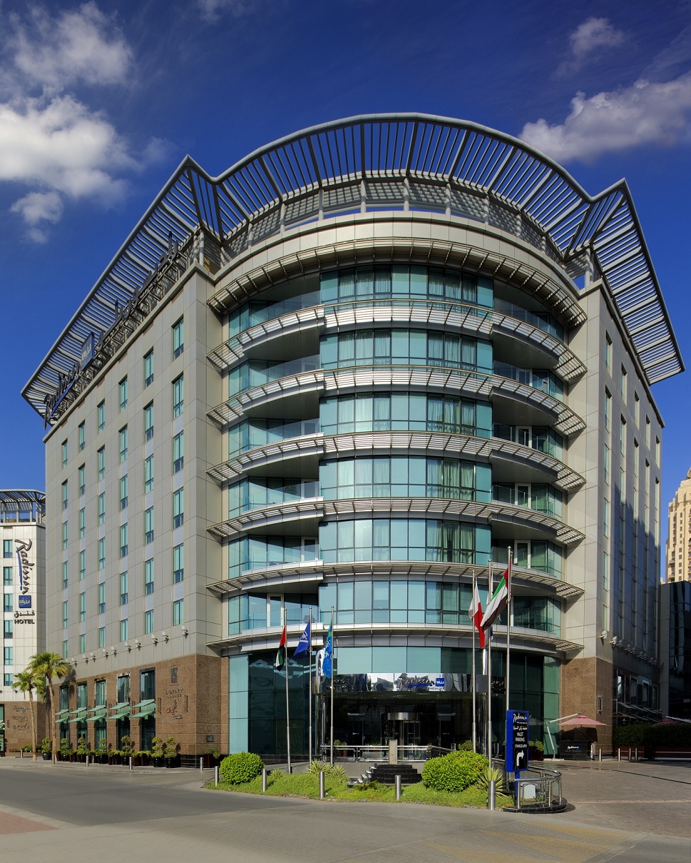
Radisson Blu Hotel, in Al Sufouh at Dubai Media City has recently deployed wireless infrastructure from Aruba, a Hewlett Packard Enterprise Company, to deliver secure, seamless, high-speed, wireless internet connectivity across its hotel rooms, suites and public areas. The implementation has resulted in improvement in rating of Wi-Fi services and drastic reduction in volume of IT help desk calls, besides the fact that the design of the Access Points (APs) blends seamlessly with the hotel aesthetics and AP management, monitoring and troubleshooting has become centralized and simplified.

For a hotel geared towards business travelers, fast, easy and reliable connectivity was high on the list of expectations for the organization’s guests. Based on guest feedback received via its Medallia guest survey, the hotel realized that it needed to upgrade its wireless network in terms of both performance and coverage. “It is our Group’s policy to offer complimentary Wi-Fi connectivity and with typical business travelers bringing anywhere between one to five wireless devices, we needed a solution that could cope with growing demands over the next five years. We did our due diligence and were guided by Aruba’s local gold partner, EMW who assured us that Aruba would offer the best solution in terms of performance, simplicity, manageability and security,” said Mr. Rushdy Mubarak, IT Manager at Radisson Blu Hotel, DMC.

Aruba’s team of network professionals conducted a detailed site survey and determined that while 802.11ac solutions would be required to support high density environments such as meeting rooms and public areas, its 802.11n solutions would be sufficient for coverage in guest rooms. This meant the hotel could meet guests’ demands for a reasonable cost. Aruba’s 275 Outdoor APs were selected for the outdoor areas as they provided impressive wide-area coverage, while Aruba 225 and Aruba 205 APs were chosen for the meeting rooms. To provide the highest level of service, 802.11ac coverage was extended to the suites while the Aruba 103H Hospitality AP was selected for the remaining rooms. To simplify manageability of the new network, two Aruba 7210 mobility controllers and Aruba’s AirWave network management platform were also selected for the deployment.

Graeme Kane, Business Development Manager, Hospitality at Aruba says, “Today’s mobile, tech-savvy traveler demands a best-in-class experience when it comes to Wi-Fi and related guest services. Aruba helps hospitality venues such as Radisson Blu boost guest satisfaction and loyalty.”

Aruba’s implementation partner EMW meticulously planned the deployment around predicted occupancy patterns, so as to rollout the new wireless infrastructure without any inconvenience to hotel guests. The plug and play nature of Aruba’s APs greatly sped up the installation process. Overall, the implementation proceeded without a hitch which was testament to the ease-of-use of Aruba’s solutions and the expertise of EMW. “We had no technology related issues. And because of proper planning the deployment was seamlessly executed,” said Mr. Rushdy.

The positive impact that the new solution had on guests was instantly noticeable. This was reflected in the feedback received via the Medallia survey which saw ratings for Wi-Fi connectivity improve from 7 to above 9 on a scale of 10.

“We also noted better reviews being posted on sites such as TripAdvisor which is essential to attracting new patrons to our hotel,” said Mr. Rushdy. “We see this itself as being as justification of the project as it directly impacts our revenues.”

Most importantly, since completion of the project, the IT team no longer receives complaints relating to poor coverage. “We have seen a 90 to 95 percent reduction in the number of help desk calls. Furthermore, the few remaining issues are now non-technical and therefore easily resolved,” said Mr. Rushdy.

Central to the success of the Aruba deployment was its ability to meet the hotel’s demands for the next five years. And Rushdy is quick to point out that even a 200% increase in bandwidth would not “max out" the APs.

“We are very pleased to be partners with Aruba Networks as their portfolio complements our solutions. Having achieved the Highest Growth Partner Award for this year from Aruba has raised our confidence to promote their products portfolio. Radisson has been our customer for over 10 years and to position this state of the art wireless solution has been our business pleasure,” said Mr. Serjios Hage, Group CEO at EMWme

Commenting on his overall satisfaction with the deployment, Mr. Rushdy concluded, “Aruba is a clear choice for the hospitality domain. The company’s solutions perfectly address all Wi-Fi challenges and enable us to consistently deliver the highest performance and reliability. With this becoming an essential service to business and leisure travelers alike, it gives us a competitive edge.”

Popular posts from this blog

Amazon.in launches “Smart Living Store”

How would it be if you could stream online videos or browse websites on your TV? How about a device that could measure your level of activity throughout the day? How would it be if a device helps keep your home secure? With the Smart Living Store you can find out! Amazon.in announces the launch of “Smart Living Store” - a dedicated store aimed at providing customers the one stop shop for all smart devices across various product categories.

Trends and Technologies Fuelling the Evolution of Middleware

By: Mike Piech, vice president and general manager, Middleware, Red Hat
The term 'middleware' has been used for many years to broadly categorise the set of behind-the-scenes technologies designed to help enterprises create, connect, and manage the myriad of software applications that run today's businesses. These applications can vary greatly, but are all meant to address specific business needs, such as insurance claims automation, financial fraud detection, transaction processing, or even to provide tailored interactions with customers based on time, location, preferences, and more.